Learn how to make good YouTube thumbnails with this guide on design, psychology, and strategy. Boost your CTR and get more views with proven techniques.

Written by:
A truly great YouTube thumbnail is a potent mix of three things: an image that packs an emotional punch, text that’s bold and to the point, and colors with enough contrast to stop a user mid-scroll. Think of it as your video's visual sales pitch; it’s often the single biggest lever you can pull to improve your Click-Through Rate (CTR).
We've all been there. You spend days, maybe even weeks, crafting the perfect video, only for it to land with a thud, getting just a handful of views. It's a gut-wrenching feeling. The hard-to-swallow truth is that the problem probably isn't your video. It's the packaging.
Your thumbnail isn't just some decorative preview. It’s the single most critical piece of marketing you have for that content.
Imagine the YouTube homepage as a massive, bustling digital shelf. Every thumbnail is a product fighting for attention. A phenomenal video wrapped in a bland thumbnail is like a brilliant product stuck in a plain cardboard box, people are just going to walk right by.
You don't earn views with your content initially. You earn them with your thumbnail and title. A viewer makes a snap judgment, a split-second decision on whether to click, and that decision is driven almost entirely by that little image. A compelling thumbnail promises value, piques curiosity, or forges an instant emotional connection, all of which tells the viewer, "This is worth your time."
This first impression has a direct, and massive, impact on your video’s most important metric:
A low CTR, on the other hand, tells the algorithm your video isn't grabbing anyone's attention. As a result, it will quickly stop promoting it. This is how a great video can "die" within hours, its thumbnail failed the one job it had.
So, how do we build a thumbnail that works? It starts by understanding the foundational pieces.
Before diving into the step-by-step process, it helps to see the core components at a glance. Think of these as the non-negotiable ingredients for any successful thumbnail.
Mastering these four elements is the foundation of turning passive scrollers into engaged viewers.
This visual guide breaks down the workflow for putting these elements together.
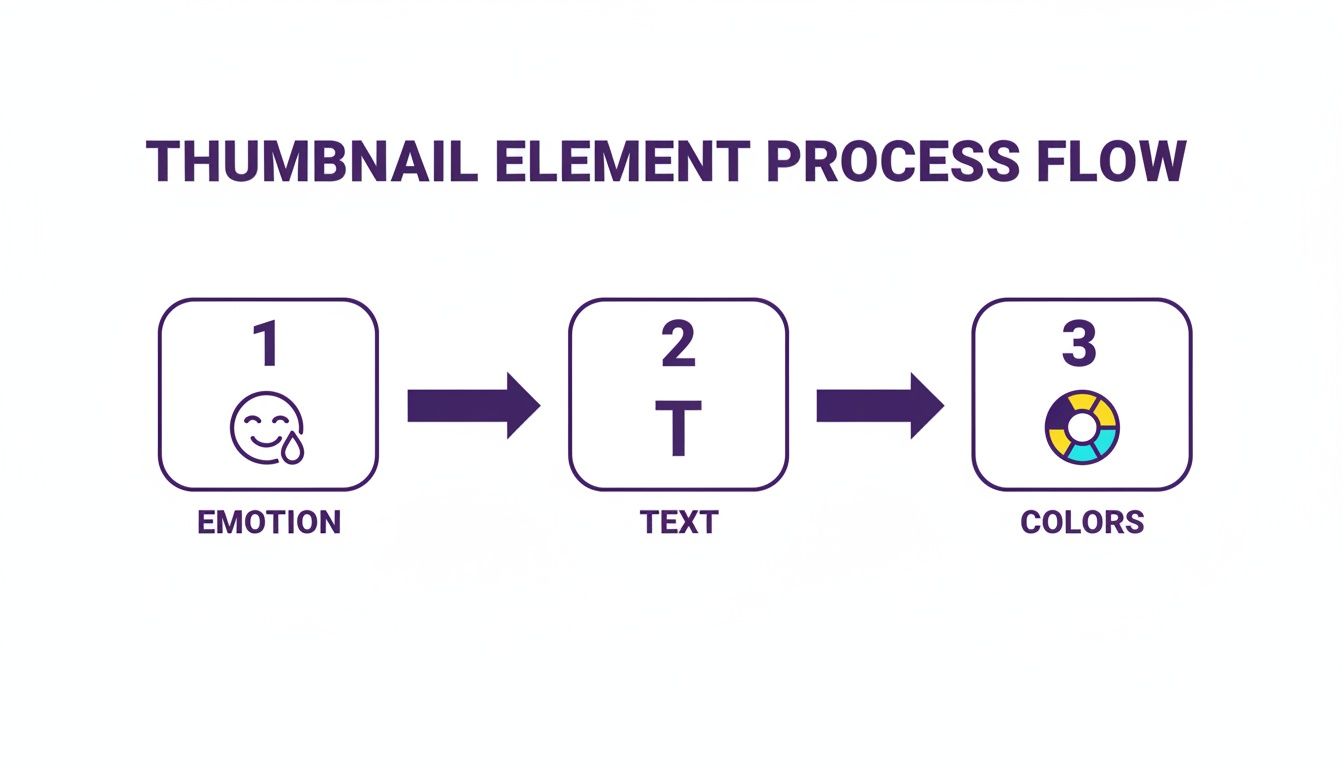
As you can see, the process always starts with emotion. From there, you clarify the idea with a few choice words and amplify the entire package with strategic color choices. Getting this flow right is the key. And if you're looking to streamline things, tools like Taja for Creators can even help automate parts of this creative process.
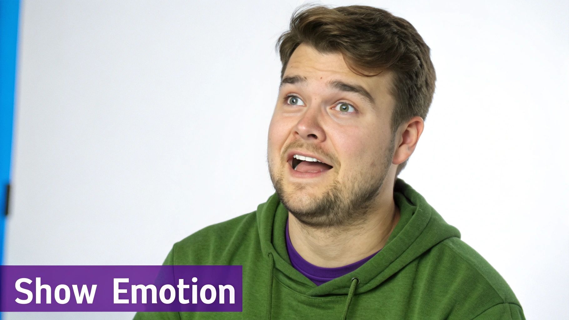
At its heart, your thumbnail’s main image isn’t just a random screenshot. It's a single, powerful frame chosen specifically to spark an emotion. A truly great thumbnail tells a micro-story all on its own, creating a connection with a potential viewer before they’ve even read your title. It all comes down to a little bit of human psychology.
Our brains are hardwired to notice and react to other people's faces, especially when they're showing a strong emotion. This is a massive shortcut for grabbing someone's attention in a sea of other videos. Think about it, a thumbnail with a look of genuine surprise, deep concentration, or pure joy creates an immediate emotional hook.
There's real data to back this up. Analyses of top-performing videos consistently show that expressive faces can seriously boost click-through rates. One study even found that videos with a human face got, on average, a staggering 921,000 more views than those without. That’s the power of putting a face to your content. If you want to dig deeper into why this works so well, check out Nearstream's thumbnail analysis.
Often, the absolute best image is already hiding somewhere in your video footage. Your job is to play detective. Scrub through your timeline and hunt for that single frame that captures the peak emotional moment of your entire video. Please, don't just settle for a generic, smiling-at-the-camera shot.
Instead, be on the lookout for moments like these:
The Reaction Shot: This is gold. It’s that split second where you react to something shocking, hilarious, or frustrating. A wide-eyed gasp or a face of total disbelief is way more interesting than a neutral expression.
The "Aha!" Moment: Pinpoint the frame where you finally solve the problem or have a breakthrough. This look conveys expertise and signals to the viewer that you have a valuable solution to share.
Intense Focus: A shot of you completely absorbed in what you're doing creates a ton of intrigue. It makes people stop and wonder, "What are they so focused on?"
Pro Tip: Don't be afraid to look a little over-the-top. Expressions that feel exaggerated when you're filming often look just right on a tiny thumbnail. A bit of extra drama helps the emotion pop on a small screen.
If you scrub through your video and just can't find that perfect shot, no sweat. Just take a dedicated thumbnail photo after you're done filming. Set your camera back up and consciously act out the exact emotion you want. This gives you way more control over the lighting, angle, and the intensity of your expression.
So you've got your emotionally charged image. Now what? The way you arrange it on the canvas makes a huge difference. You don't need to be a graphic designer to use a few basic composition tricks to make your thumbnail more effective. The whole point is to create a clear focal point that tells the viewer's eye exactly where to look.
One of the easiest and most powerful techniques is the rule of thirds. Just imagine your thumbnail has a 3x3 grid overlaid on it. Instead of plopping your main subject right in the dead center, try placing it along one of the lines or where the lines intersect. This one small tweak instantly makes the image feel more dynamic and professional.
For instance, position your face on the left or right third of the frame. This leaves the other two-thirds wide open for your text or other graphics, like an arrow or a logo. It creates a much cleaner, more natural flow and keeps the thumbnail from feeling cramped. By being intentional with your composition, you're not just making a pretty picture; you're building a thumbnail that tells a clearer story and earns that click.
The words you plaster on your thumbnail aren't just a label; they're the hook. While a great image might get someone’s attention, the right text is what creates that irresistible itch, that information gap that makes someone have to click. It's about pairing your visual story with a short, punchy caption that leaves the viewer desperately needing an answer.
Think of your thumbnail as a tiny billboard flashing past someone's eyes on a phone screen. Clarity and brevity aren't just nice to have; they're everything. Jamming it full of words is one of the fastest ways to get ignored.
When it comes to thumbnail text, less is almost always more. I live by a simple rule: five words or fewer. This isn't just an arbitrary guideline; it's a practical limit for mobile viewing. You need that text to be huge and instantly readable, and you just can't do that with a full sentence.
For instance, instead of writing "My Complete Guide to Fixing Common Plumbing Issues," a thumbnail that just says "This ONE Mistake..." over a picture of a flooded bathroom is way more powerful. The short, punchy text creates immediate intrigue.
Your font choice says a lot about your video's tone. It’s easy to get tempted by flashy, decorative fonts, but trust me, the best choices are almost always bold, clean, and dead simple. There's a reason you see sans-serif fonts like Montserrat, Anton, or Impact everywhere, they are incredibly easy to read, even when shrunk down to a tiny size.
To make sure your text always pops, never just slap it onto a busy background. Here are a few dead-simple design tricks I use all the time:
Add an Outline: A simple black or white stroke around the letters provides instant separation.
Use a Solid Backdrop: Placing a solid color block or shape behind your text cuts through any visual noise.
Create a Subtle Shadow: A soft drop shadow gives the text a bit of depth, lifting it off the background.
These tiny tweaks can make the difference between text that's readable and text that gets lost in the image.
The most effective thumbnail text doesn't describe the content, it teases the outcome. It poses a question, hints at a secret, or highlights a conflict, making the viewer feel like they are missing out if they don't click.
Now for the fun part: the actual words. This is your secret weapon. The goal here is to trigger an emotion, curiosity, urgency, or even a little bit of fear. Using powerful "trigger words" works so well because it taps directly into human psychology.
Try weaving in words like these:
Secret: Hints at exclusive, valuable info.
Mistake: Plays on our fear of doing something wrong.
Finally: Suggests a long-awaited solution is here.
Warning: Creates instant urgency and a need to know more.
Posing a provocative question is another classic that works wonders. A thumbnail with the text "Is This The END?" paired with a dramatic image is far more compelling than one that just announces the topic. It’s all about writing text that makes people stop scrolling and think, "Wait, I need to know what happens next."
Think about the YouTube homepage for a second. It's a visual battlefield, with dozens of thumbnails all screaming for attention. In that chaotic environment, color isn't just a design choice, it's your secret weapon. The right color palette can literally stop someone from scrolling, turning a casual glance into a definite click. This isn't about being an artist; it's about being a strategist.

It all starts with a little color psychology. Colors carry emotional baggage, and you can use that to your advantage. If your video is about a huge financial mistake, a splash of urgent red or a jarring yellow immediately tells the viewer's brain something is wrong. On the flip side, a complex software tutorial might use a calm, reassuring blue to communicate expertise and clarity.
If you remember one thing about color, make it this: contrast is everything. Your main subject has to pop right off the background. It's not a suggestion; it's a non-negotiable rule for making sure your thumbnail is visible on a tiny phone screen, a huge TV, and in both of YouTube’s light and dark modes.
One of the biggest mistakes I see is a dark subject plopped onto a dark background. The whole thing just turns into a muddy, unreadable smudge. Your goal is to create a sharp, clean separation that yanks the viewer's eye straight to the most important thing, your face, a key object, or the headline.
Here are a few tried-and-true tricks to get that killer contrast:
Complementary Colors: Dust off that old color wheel from art class and pick colors from opposite sides. An orange outline around a person against a deep blue sky? That’s an electric combo that’s hard to ignore.
Vibrant Glows: This is a classic YouTube trick for a reason. Adding a bright, soft glow behind your subject, maybe a clean white or a punchy neon green, lifts it right off the background, giving it an almost 3D feel.
Desaturate the Background: An incredibly simple but effective technique is to just pull some of the color out of the background image. This instantly makes your full-color subject the undisputed star of the show.
I have a quick-and-dirty method for checking my work called "the squint test." Shrink your finished thumbnail down to the size of a postage stamp on your monitor and squint your eyes. Can you still tell what the subject is and read the main word? If so, you've nailed it.
Color and design aren't just about one video; they're about building your channel's identity. When your branding is consistent, your loyal subscribers can spot your new video in a crowded feed without even reading the title. It’s a visual shortcut that says, "Hey, one of my favorite creators just posted!"
This doesn’t mean every thumbnail has to be a carbon copy. It’s more about creating a cohesive visual language. Think about establishing a few consistent elements that tie everything together.
A simple brand kit for your thumbnails is a great place to start. It should include:
A Core Color Palette: Just two or three main brand colors are all you need.
A Go-To Font: Pick one bold, super-readable font and stick with it.
Consistent Logo Placement: If you include a logo, put it in the same corner every single time.
This kind of consistency builds trust and familiarity. Viewers start to associate your specific visual style with the quality content you deliver, making them far more likely to click. That's how you make thumbnails that don't just grab new eyeballs but also help build a loyal community.
Let's be honest: making a truly great thumbnail has always been a bit of a grind. For years, the process was a time-suck. You'd have to scrub through your entire video, hoping to find that one perfect frame. Then came the tedious part: screenshotting it, pulling it into Photoshop, and painstakingly cutting out the background. An hour later, you're still just getting started on the text and colors. It's a massive bottleneck, especially when you've got another video to edit.
But what if you could just… skip all that? AI tools are completely flipping the script, turning what used to be a multi-hour headache into a quick, five-minute task. You're no longer starting from a blank slate; you're starting with designs that are practically ready to go.
This isn't just theory. Take a look at how an AI analyzes a video to pull out frames with the most potential.
The system is smart enough to spot the moments with the best facial expressions and strongest emotional cues. It hands you the perfect visual starting points on a silver platter, so you can stop hunting for them yourself.
Picture this: you upload your finished video, and in a few minutes, you get back a handful of polished thumbnail options. That’s the reality now. These tools analyze your video’s content and pinpoint the most emotionally charged frames, those split-second moments of surprise, deep focus, or genuine joy that make people want to click.
From that point, the whole workflow is streamlined. Some of the most helpful features I've seen include:
One-Click Background Removal: This is a lifesaver. It instantly isolates you or your subject from the background, a task that used to drive me crazy with manual selection tools.
Intelligent Text Suggestions: Instead of wracking your brain for a good title, the AI suggests several short, punchy variations designed to create curiosity. It’s like having a brainstorming partner.
Easy Brand Customization: You can quickly apply your channel’s unique fonts, color palette, and logos. This helps keep your videos looking professional and instantly recognizable.
This isn't just about making one thumbnail a little faster. For podcasters, marketers, and creators of all stripes, it's a real strategic advantage. When you dig into how AI-generated thumbnails work, you see it’s about freeing up your time to focus on what really matters: creating killer content.
By automating the most repetitive and tedious design tasks, creators are getting back hours every single week. That extra time means you can stick to a more consistent publishing schedule and even have the bandwidth to A/B test your thumbnails, which is one of the fastest ways to boost your click-through rates and grow your channel.
This really is a fundamental shift in the creative workflow. The whole idea is to remove the friction between having a great video and getting it seen. For anyone serious about scaling their content without letting quality slip, AI isn't just a neat trick anymore, it's essential for staying competitive.
You've designed what you think is the perfect thumbnail. But here's the hard truth: your opinion doesn't matter nearly as much as your audience's. The only way to truly know if your thumbnail works is to move beyond guesswork and let the data do the talking. This is where you shift from being just a creator to a savvy strategist.
The most important number you need to watch is your Click-Through Rate (CTR). You'll find this metric deep inside your YouTube Analytics, and it's brutally honest. It tells you exactly what percentage of people who saw your thumbnail actually clicked to watch. It's the ultimate report card for your thumbnail's performance.
So, what's a "good" number? Most channels see their CTR land somewhere between 2% and 10%. The real goal, though, is to consistently hit that sweet spot of 5-7% or higher. Creators who achieve this have mastered the art of crafting thumbnails that simply can't be ignored. If you're seeing your CTR dip below the 3-4% mark, that's a flashing red light telling you the thumbnail isn't pulling its weight.
A high CTR is a powerful signal to the YouTube algorithm. It essentially screams, "People want to watch this!" This encourages the platform to push your video to a wider audience, turning your thumbnail into the gatekeeper for massive growth.
The single best way to boost your CTR is through A/B testing. It sounds technical, but it’s really just comparing two different thumbnails (Version A vs. Version B) to see which one gets more clicks.
The key is to keep it simple. Don't go crazy changing everything at once. Instead, tweak just one significant element at a time so you know exactly what made the difference.
Here are a few easy tests you can run right away:
Emotion vs. Action: Does a close-up of a dramatic facial expression work better than a shot of you doing something from the video?
Text Variations: Pit a thumbnail with a bold, curiosity-driven question against another with a clear, benefit-oriented statement.
Color Schemes: Test a bright, high-contrast design against one that's more subtle and aligns with your channel's branding.
This used to be a tedious process, but modern AI tools like Thumbnail Maker have made it ridiculously easy by generating multiple design options right from the get-go. If you're weighing your options for other AI-powered tools, you might find our Taja vs. VidIQ comparison useful.
By getting into a rhythm of testing and measuring, you build a data-backed understanding of what your audience wants, giving every single thumbnail you create the best possible chance to succeed.
Even after you’ve got a solid process down, a few nagging questions always seem to surface. I get asked these all the time, so let's clear up some of the most common hangups creators have when designing their thumbnails.
You’ll want to stick to YouTube’s official recommendation: 1280x720 pixels. This gives you a perfect 16:9 aspect ratio, which is the standard for video.
Following this spec is non-negotiable. It ensures your thumbnail looks crisp and professional everywhere it’s displayed, whether that's on a 60-inch TV or a smartphone screen. Also, make sure your final file is under the 2MB limit and saved as a JPG, PNG, or GIF to avoid any upload headaches.
Not at all. While a human face can create an instant connection and draw the eye, it’s not a golden rule for every single video. The real goal is to use the image that most powerfully communicates what your video is about and makes someone need to know more.
Think about your content type:
For tutorials, a super clear "before and after" shot or a glimpse of the impressive final result can be way more compelling than your face.
If you're doing reviews, showing the product in a dynamic, interesting way is usually the best bet.
But for vlogs and commentary videos, your expressive reaction is the main event. In those cases, your face is absolutely central to selling the click.
The real test is this: does the thumbnail instantly deliver on the video's promise? If a face does that best, great. If a shot of a perfectly organized spreadsheet does it better, use that instead.
Ultimately, you're aiming for that perfect mix of clarity and curiosity.
Ready to stop guessing and start creating thumbnails that get clicks? Thumbnail Maker uses AI to find your video's best moments, remove backgrounds, and generate stunning designs in seconds. Start your free trial at thumbnailmaker.studio.
A truly great YouTube thumbnail is a potent mix of three things: an image that packs an emotional punch, text that’s bold and to the point, and colors with enough contrast to stop a user mid-scroll. Think of it as your video's visual sales pitch; it’s often the single biggest lever you can pull to improve your Click-Through Rate (CTR).
We've all been there. You spend days, maybe even weeks, crafting the perfect video, only for it to land with a thud, getting just a handful of views. It's a gut-wrenching feeling. The hard-to-swallow truth is that the problem probably isn't your video. It's the packaging.
Your thumbnail isn't just some decorative preview. It’s the single most critical piece of marketing you have for that content.
Imagine the YouTube homepage as a massive, bustling digital shelf. Every thumbnail is a product fighting for attention. A phenomenal video wrapped in a bland thumbnail is like a brilliant product stuck in a plain cardboard box, people are just going to walk right by.
You don't earn views with your content initially. You earn them with your thumbnail and title. A viewer makes a snap judgment, a split-second decision on whether to click, and that decision is driven almost entirely by that little image. A compelling thumbnail promises value, piques curiosity, or forges an instant emotional connection, all of which tells the viewer, "This is worth your time."
This first impression has a direct, and massive, impact on your video’s most important metric:
A low CTR, on the other hand, tells the algorithm your video isn't grabbing anyone's attention. As a result, it will quickly stop promoting it. This is how a great video can "die" within hours, its thumbnail failed the one job it had.
So, how do we build a thumbnail that works? It starts by understanding the foundational pieces.
Before diving into the step-by-step process, it helps to see the core components at a glance. Think of these as the non-negotiable ingredients for any successful thumbnail.
Mastering these four elements is the foundation of turning passive scrollers into engaged viewers.
This visual guide breaks down the workflow for putting these elements together.
As you can see, the process always starts with emotion. From there, you clarify the idea with a few choice words and amplify the entire package with strategic color choices. Getting this flow right is the key. And if you're looking to streamline things, tools like Taja for Creators can even help automate parts of this creative process.
At its heart, your thumbnail’s main image isn’t just a random screenshot. It's a single, powerful frame chosen specifically to spark an emotion. A truly great thumbnail tells a micro-story all on its own, creating a connection with a potential viewer before they’ve even read your title. It all comes down to a little bit of human psychology.
Our brains are hardwired to notice and react to other people's faces, especially when they're showing a strong emotion. This is a massive shortcut for grabbing someone's attention in a sea of other videos. Think about it, a thumbnail with a look of genuine surprise, deep concentration, or pure joy creates an immediate emotional hook.
There's real data to back this up. Analyses of top-performing videos consistently show that expressive faces can seriously boost click-through rates. One study even found that videos with a human face got, on average, a staggering 921,000 more views than those without. That’s the power of putting a face to your content. If you want to dig deeper into why this works so well, check out Nearstream's thumbnail analysis.
Often, the absolute best image is already hiding somewhere in your video footage. Your job is to play detective. Scrub through your timeline and hunt for that single frame that captures the peak emotional moment of your entire video. Please, don't just settle for a generic, smiling-at-the-camera shot.
Instead, be on the lookout for moments like these:
The Reaction Shot: This is gold. It’s that split second where you react to something shocking, hilarious, or frustrating. A wide-eyed gasp or a face of total disbelief is way more interesting than a neutral expression.
The "Aha!" Moment: Pinpoint the frame where you finally solve the problem or have a breakthrough. This look conveys expertise and signals to the viewer that you have a valuable solution to share.
Intense Focus: A shot of you completely absorbed in what you're doing creates a ton of intrigue. It makes people stop and wonder, "What are they so focused on?"
Pro Tip: Don't be afraid to look a little over-the-top. Expressions that feel exaggerated when you're filming often look just right on a tiny thumbnail. A bit of extra drama helps the emotion pop on a small screen.
If you scrub through your video and just can't find that perfect shot, no sweat. Just take a dedicated thumbnail photo after you're done filming. Set your camera back up and consciously act out the exact emotion you want. This gives you way more control over the lighting, angle, and the intensity of your expression.
So you've got your emotionally charged image. Now what? The way you arrange it on the canvas makes a huge difference. You don't need to be a graphic designer to use a few basic composition tricks to make your thumbnail more effective. The whole point is to create a clear focal point that tells the viewer's eye exactly where to look.
One of the easiest and most powerful techniques is the rule of thirds. Just imagine your thumbnail has a 3x3 grid overlaid on it. Instead of plopping your main subject right in the dead center, try placing it along one of the lines or where the lines intersect. This one small tweak instantly makes the image feel more dynamic and professional.
For instance, position your face on the left or right third of the frame. This leaves the other two-thirds wide open for your text or other graphics, like an arrow or a logo. It creates a much cleaner, more natural flow and keeps the thumbnail from feeling cramped. By being intentional with your composition, you're not just making a pretty picture; you're building a thumbnail that tells a clearer story and earns that click.
The words you plaster on your thumbnail aren't just a label; they're the hook. While a great image might get someone’s attention, the right text is what creates that irresistible itch, that information gap that makes someone have to click. It's about pairing your visual story with a short, punchy caption that leaves the viewer desperately needing an answer.
Think of your thumbnail as a tiny billboard flashing past someone's eyes on a phone screen. Clarity and brevity aren't just nice to have; they're everything. Jamming it full of words is one of the fastest ways to get ignored.
When it comes to thumbnail text, less is almost always more. I live by a simple rule: five words or fewer. This isn't just an arbitrary guideline; it's a practical limit for mobile viewing. You need that text to be huge and instantly readable, and you just can't do that with a full sentence.
For instance, instead of writing "My Complete Guide to Fixing Common Plumbing Issues," a thumbnail that just says "This ONE Mistake..." over a picture of a flooded bathroom is way more powerful. The short, punchy text creates immediate intrigue.
Your font choice says a lot about your video's tone. It’s easy to get tempted by flashy, decorative fonts, but trust me, the best choices are almost always bold, clean, and dead simple. There's a reason you see sans-serif fonts like Montserrat, Anton, or Impact everywhere, they are incredibly easy to read, even when shrunk down to a tiny size.
To make sure your text always pops, never just slap it onto a busy background. Here are a few dead-simple design tricks I use all the time:
Add an Outline: A simple black or white stroke around the letters provides instant separation.
Use a Solid Backdrop: Placing a solid color block or shape behind your text cuts through any visual noise.
Create a Subtle Shadow: A soft drop shadow gives the text a bit of depth, lifting it off the background.
These tiny tweaks can make the difference between text that's readable and text that gets lost in the image.
The most effective thumbnail text doesn't describe the content, it teases the outcome. It poses a question, hints at a secret, or highlights a conflict, making the viewer feel like they are missing out if they don't click.
Now for the fun part: the actual words. This is your secret weapon. The goal here is to trigger an emotion, curiosity, urgency, or even a little bit of fear. Using powerful "trigger words" works so well because it taps directly into human psychology.
Try weaving in words like these:
Secret: Hints at exclusive, valuable info.
Mistake: Plays on our fear of doing something wrong.
Finally: Suggests a long-awaited solution is here.
Warning: Creates instant urgency and a need to know more.
Posing a provocative question is another classic that works wonders. A thumbnail with the text "Is This The END?" paired with a dramatic image is far more compelling than one that just announces the topic. It’s all about writing text that makes people stop scrolling and think, "Wait, I need to know what happens next."
Think about the YouTube homepage for a second. It's a visual battlefield, with dozens of thumbnails all screaming for attention. In that chaotic environment, color isn't just a design choice, it's your secret weapon. The right color palette can literally stop someone from scrolling, turning a casual glance into a definite click. This isn't about being an artist; it's about being a strategist.
It all starts with a little color psychology. Colors carry emotional baggage, and you can use that to your advantage. If your video is about a huge financial mistake, a splash of urgent red or a jarring yellow immediately tells the viewer's brain something is wrong. On the flip side, a complex software tutorial might use a calm, reassuring blue to communicate expertise and clarity.
If you remember one thing about color, make it this: contrast is everything. Your main subject has to pop right off the background. It's not a suggestion; it's a non-negotiable rule for making sure your thumbnail is visible on a tiny phone screen, a huge TV, and in both of YouTube’s light and dark modes.
One of the biggest mistakes I see is a dark subject plopped onto a dark background. The whole thing just turns into a muddy, unreadable smudge. Your goal is to create a sharp, clean separation that yanks the viewer's eye straight to the most important thing, your face, a key object, or the headline.
Here are a few tried-and-true tricks to get that killer contrast:
Complementary Colors: Dust off that old color wheel from art class and pick colors from opposite sides. An orange outline around a person against a deep blue sky? That’s an electric combo that’s hard to ignore.
Vibrant Glows: This is a classic YouTube trick for a reason. Adding a bright, soft glow behind your subject, maybe a clean white or a punchy neon green, lifts it right off the background, giving it an almost 3D feel.
Desaturate the Background: An incredibly simple but effective technique is to just pull some of the color out of the background image. This instantly makes your full-color subject the undisputed star of the show.
I have a quick-and-dirty method for checking my work called "the squint test." Shrink your finished thumbnail down to the size of a postage stamp on your monitor and squint your eyes. Can you still tell what the subject is and read the main word? If so, you've nailed it.
Color and design aren't just about one video; they're about building your channel's identity. When your branding is consistent, your loyal subscribers can spot your new video in a crowded feed without even reading the title. It’s a visual shortcut that says, "Hey, one of my favorite creators just posted!"
This doesn’t mean every thumbnail has to be a carbon copy. It’s more about creating a cohesive visual language. Think about establishing a few consistent elements that tie everything together.
A simple brand kit for your thumbnails is a great place to start. It should include:
A Core Color Palette: Just two or three main brand colors are all you need.
A Go-To Font: Pick one bold, super-readable font and stick with it.
Consistent Logo Placement: If you include a logo, put it in the same corner every single time.
This kind of consistency builds trust and familiarity. Viewers start to associate your specific visual style with the quality content you deliver, making them far more likely to click. That's how you make thumbnails that don't just grab new eyeballs but also help build a loyal community.
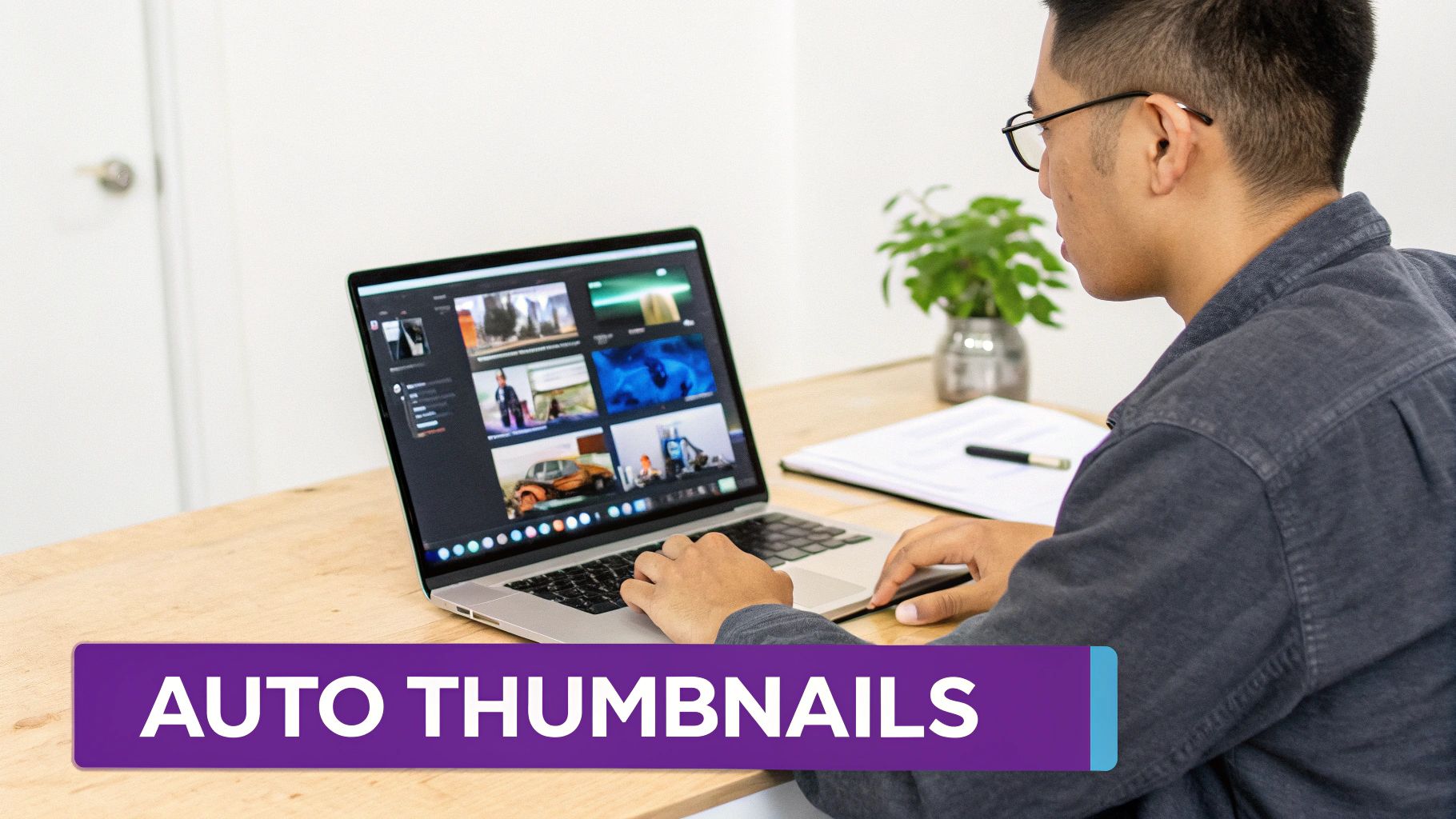
Let's be honest: making a truly great thumbnail has always been a bit of a grind. For years, the process was a time-suck. You'd have to scrub through your entire video, hoping to find that one perfect frame. Then came the tedious part: screenshotting it, pulling it into Photoshop, and painstakingly cutting out the background. An hour later, you're still just getting started on the text and colors. It's a massive bottleneck, especially when you've got another video to edit.
But what if you could just… skip all that? AI tools are completely flipping the script, turning what used to be a multi-hour headache into a quick, five-minute task. You're no longer starting from a blank slate; you're starting with designs that are practically ready to go.
This isn't just theory. Take a look at how an AI analyzes a video to pull out frames with the most potential.
The system is smart enough to spot the moments with the best facial expressions and strongest emotional cues. It hands you the perfect visual starting points on a silver platter, so you can stop hunting for them yourself.
Picture this: you upload your finished video, and in a few minutes, you get back a handful of polished thumbnail options. That’s the reality now. These tools analyze your video’s content and pinpoint the most emotionally charged frames, those split-second moments of surprise, deep focus, or genuine joy that make people want to click.
From that point, the whole workflow is streamlined. Some of the most helpful features I've seen include:
One-Click Background Removal: This is a lifesaver. It instantly isolates you or your subject from the background, a task that used to drive me crazy with manual selection tools.
Intelligent Text Suggestions: Instead of wracking your brain for a good title, the AI suggests several short, punchy variations designed to create curiosity. It’s like having a brainstorming partner.
Easy Brand Customization: You can quickly apply your channel’s unique fonts, color palette, and logos. This helps keep your videos looking professional and instantly recognizable.
This isn't just about making one thumbnail a little faster. For podcasters, marketers, and creators of all stripes, it's a real strategic advantage. When you dig into how AI-generated thumbnails work, you see it’s about freeing up your time to focus on what really matters: creating killer content.
By automating the most repetitive and tedious design tasks, creators are getting back hours every single week. That extra time means you can stick to a more consistent publishing schedule and even have the bandwidth to A/B test your thumbnails, which is one of the fastest ways to boost your click-through rates and grow your channel.
This really is a fundamental shift in the creative workflow. The whole idea is to remove the friction between having a great video and getting it seen. For anyone serious about scaling their content without letting quality slip, AI isn't just a neat trick anymore, it's essential for staying competitive.
You've designed what you think is the perfect thumbnail. But here's the hard truth: your opinion doesn't matter nearly as much as your audience's. The only way to truly know if your thumbnail works is to move beyond guesswork and let the data do the talking. This is where you shift from being just a creator to a savvy strategist.
The most important number you need to watch is your Click-Through Rate (CTR). You'll find this metric deep inside your YouTube Analytics, and it's brutally honest. It tells you exactly what percentage of people who saw your thumbnail actually clicked to watch. It's the ultimate report card for your thumbnail's performance.
So, what's a "good" number? Most channels see their CTR land somewhere between 2% and 10%. The real goal, though, is to consistently hit that sweet spot of 5-7% or higher. Creators who achieve this have mastered the art of crafting thumbnails that simply can't be ignored. If you're seeing your CTR dip below the 3-4% mark, that's a flashing red light telling you the thumbnail isn't pulling its weight.
A high CTR is a powerful signal to the YouTube algorithm. It essentially screams, "People want to watch this!" This encourages the platform to push your video to a wider audience, turning your thumbnail into the gatekeeper for massive growth.
The single best way to boost your CTR is through A/B testing. It sounds technical, but it’s really just comparing two different thumbnails (Version A vs. Version B) to see which one gets more clicks.
The key is to keep it simple. Don't go crazy changing everything at once. Instead, tweak just one significant element at a time so you know exactly what made the difference.
Here are a few easy tests you can run right away:
Emotion vs. Action: Does a close-up of a dramatic facial expression work better than a shot of you doing something from the video?
Text Variations: Pit a thumbnail with a bold, curiosity-driven question against another with a clear, benefit-oriented statement.
Color Schemes: Test a bright, high-contrast design against one that's more subtle and aligns with your channel's branding.
This used to be a tedious process, but modern AI tools like Thumbnail Maker have made it ridiculously easy by generating multiple design options right from the get-go. If you're weighing your options for other AI-powered tools, you might find our Taja vs. VidIQ comparison useful.
By getting into a rhythm of testing and measuring, you build a data-backed understanding of what your audience wants, giving every single thumbnail you create the best possible chance to succeed.
Even after you’ve got a solid process down, a few nagging questions always seem to surface. I get asked these all the time, so let's clear up some of the most common hangups creators have when designing their thumbnails.
You’ll want to stick to YouTube’s official recommendation: 1280x720 pixels. This gives you a perfect 16:9 aspect ratio, which is the standard for video.
Following this spec is non-negotiable. It ensures your thumbnail looks crisp and professional everywhere it’s displayed, whether that's on a 60-inch TV or a smartphone screen. Also, make sure your final file is under the 2MB limit and saved as a JPG, PNG, or GIF to avoid any upload headaches.
Not at all. While a human face can create an instant connection and draw the eye, it’s not a golden rule for every single video. The real goal is to use the image that most powerfully communicates what your video is about and makes someone need to know more.
Think about your content type:
For tutorials, a super clear "before and after" shot or a glimpse of the impressive final result can be way more compelling than your face.
If you're doing reviews, showing the product in a dynamic, interesting way is usually the best bet.
But for vlogs and commentary videos, your expressive reaction is the main event. In those cases, your face is absolutely central to selling the click.
The real test is this: does the thumbnail instantly deliver on the video's promise? If a face does that best, great. If a shot of a perfectly organized spreadsheet does it better, use that instead.
Ultimately, you're aiming for that perfect mix of clarity and curiosity.
Ready to stop guessing and start creating thumbnails that get clicks? Thumbnail Maker uses AI to find your video's best moments, remove backgrounds, and generate stunning designs in seconds. Start your free trial at thumbnailmaker.studio.