A Creator's Guide to Adding Chapters to YouTube Video
Learn how adding chapters to YouTube video boosts views and SEO. Our guide covers everything from manual timestamps to AI tools for creators.
Learn More
5 min read
February 9, 2026
Discover 10 actionable YouTube thumbnail tips to boost your click-through rate. Learn design, A/B testing, and composition secrets for better channel growth.

Written by:
On YouTube, your thumbnail is the digital storefront for your video. It is the single most critical element determining whether a potential viewer clicks or scrolls past. A phenomenal video with a mediocre thumbnail will underperform, while a good video with an exceptional thumbnail can achieve viral success. The difference between channel growth and stagnation often comes down to mastering this one, often-overlooked skill.
This guide moves beyond generic advice to provide a comprehensive roundup of actionable youtube thumbnail tips used by top creators to dominate their niches. We will dissect the exact strategies that turn a simple image into a powerful click-driving asset. You will learn not just what to do, but how to implement these techniques for maximum impact.
Inside, we will cover everything from the fundamentals of visual design to advanced optimization tactics, including:
These are not vague suggestions but a precise blueprint for improving your click-through rate. By implementing the specific youtube thumbnail tips detailed in this list, you can ensure your hard work gets the viewership it truly deserves, transforming your thumbnails from simple placeholders into strategic tools for audience growth.
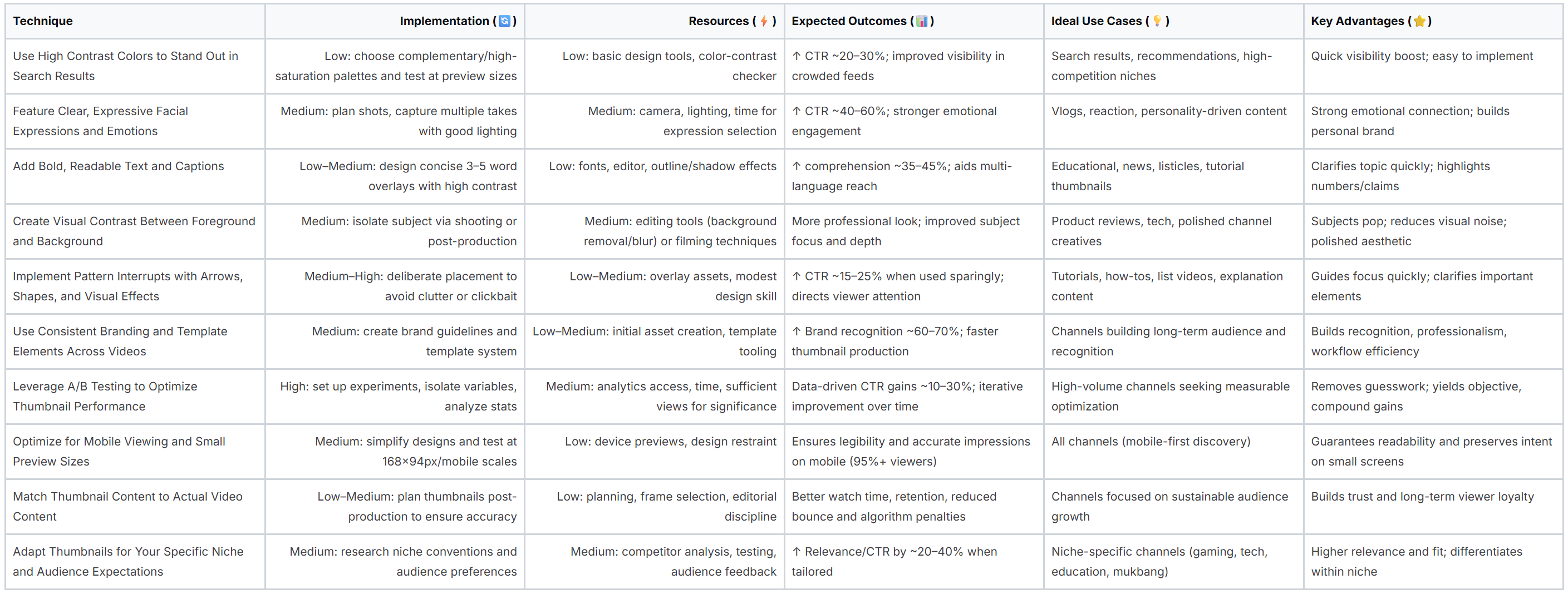
On a crowded YouTube homepage or in a long list of search results, your video thumbnail is just one small rectangle among dozens. To capture a viewer's attention in the split second they take to scan the page, you need a design that immediately pops. High contrast color combinations are one of the most powerful and fundamental youtube thumbnail tips for achieving this instant visual impact.
The principle is simple: use colors that are dramatically different from one another to create a clear, bold image that is easy to decipher even at a small size. This involves pairing bright, saturated colors with dark backgrounds or using complementary colors, which are opposites on the color wheel (like blue and orange or red and green). This deliberate color clash forces the key elements of your thumbnail to stand out, making it more compelling and clickable.
Creators like MrBeast, known for his vibrant yellow and red designs, and Ali Abdaal, who often uses bold text on clean, contrasting backgrounds, leverage this technique to great effect. Their thumbnails are instantly recognizable and draw the eye, significantly increasing the likelihood of a click. The human eye is naturally drawn to contrast, as it helps our brain quickly process visual information and separate an object from its background.
Humans are hardwired to recognize and respond to faces, making emotional expressions one of the most powerful youtube thumbnail tips you can use. A clear, authentic look of surprise, confusion, excitement, or shock instantly communicates the video's core hook and creates a powerful sense of curiosity. This element works because emotions are contagious; viewers subconsciously mirror the expression they see, making them more likely to click to find out why the creator feels that way.
This psychological connection grabs attention far more effectively than a neutral or generic image. By featuring a face, you are not just showing what the video is about; you are showing how the viewer is supposed to feel about it, establishing an immediate emotional rapport that is difficult to ignore in a sea of competing content.
Creators like David Dobrik, who popularized the signature "shocked face" thumbnail in vlogs, and reaction channels that thrive on exaggerated emotions, have built entire careers on this principle. Their thumbnails promise a strong emotional payoff, telling the viewer that something extraordinary happens in the video. The face acts as a universal language, conveying a story preview that transcends text and graphics.
While your video’s title provides the formal description, the text on your thumbnail acts as the immediate, high-impact headline. It's your first and best chance to tell a potential viewer exactly what your video is about and why they should care. Adding bold, concise, and readable text is a cornerstone of effective youtube thumbnail tips, as it instantly provides context and creates intrigue.
The key is to create a text overlay that complements, rather than duplicates, your video title. Think of it as a hook. A short, powerful phrase or question can spark curiosity and provide crucial information that convinces a user to click. The text must be large enough and clear enough to be read in a fraction of a second, even when the thumbnail is displayed at its smallest size on a mobile device.
Creators like Ali Abdaal, with his massive "STUDY WITH ME" overlays, or Roman Atwood, who uses minimal but powerful captions, masterfully use text to summarize the core value of their content. This approach works because it removes ambiguity. Viewers immediately understand the video's promise, which reduces friction and increases the click-through rate. Well-executed text transforms a simple image into a compelling advertisement for your content.
An effective YouTube thumbnail is rarely a flat image; it has depth and dimension that guides the viewer's eye to the most important element. Creating a clear visual separation between the foreground (the main subject, like a person or object) and the background is a crucial technique for making your thumbnail pop. This layering principle ensures the central focus of your video is immediately identifiable, even when viewed at a very small size on a mobile device.
This approach is one of the most impactful youtube thumbnail tips because it prevents your design from looking cluttered or confusing. By blurring, darkening, or simplifying the background, you are essentially telling the viewer, "This is the most important part of the image." This technique creates a professional, polished look that draws viewers in and makes your content appear more appealing and well-produced.
Top creators like Marques Brownlee (MKBHD) master this by placing crystal-clear images of tech products against clean, often out-of-focus backgrounds. This immediately highlights the subject of his review. Similarly, channels like Dude Perfect use bright, solid-color backgrounds to make their energetic poses and subjects stand out with incredible sharpness. This separation makes the thumbnail's story easy to understand in a fraction of a second, which is critical for capturing clicks in a competitive feed.
When a viewer scrolls through their YouTube feed, their brain quickly falls into a predictable scanning pattern. To make your video stand out, you need to break that pattern. Pattern interrupts are visual elements like arrows, circles, or subtle effects that disrupt a viewer's passive scrolling and intentionally guide their focus. This is one of the most effective youtube thumbnail tips for directing attention and creating a sense of curiosity.
These visual cues act as "attention magnets," drawing the eye directly to the most compelling part of your thumbnail, whether it's your face, a surprising object, or a key piece of text. By breaking the visual monotony of a grid of thumbnails, you force the viewer to pause and process your image, significantly increasing the chance they will click to learn more.
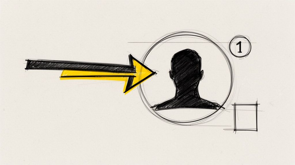
Creators like Graham Stephan strategically use arrows to highlight shocking numbers in his finance videos, while educational channels might use a numbered circle to frame a specific element in a tutorial. These additions are not random; they create a visual hierarchy that tells the viewer's brain, "Look here first." This guided viewing experience makes the thumbnail's core message easier to understand in a fraction of a second, which is critical for earning a click.
When viewers scroll through their subscriptions or browse search results, your thumbnail is your channel's business card. Establishing visual consistency across your videos is a crucial strategy for building brand recognition, signaling professionalism, and helping your content become instantly identifiable. This is one of the most powerful youtube thumbnail tips for cultivating a loyal audience that can spot your work in a crowded feed.
The principle is to create a cohesive visual language through repeating elements. By using the same color schemes, font families, logo placement, and layout styles, you train viewers to associate a specific aesthetic with your channel. This consistency creates a powerful brand moat, making your videos feel like part of a recognizable and high-quality series rather than just a collection of random uploads.
Top creators have mastered this technique. MrBeast's signature bright red and yellow backgrounds, Ali Abdaal's clean gold and white text overlays, and Veritasium’s consistent blue and orange palette are instantly recognizable. This visual shorthand tells subscribers, "This is a video from a creator you trust," prompting a click based on brand loyalty even before they have fully processed the thumbnail's specific content.
Relying on intuition alone is one of the biggest mistakes creators make with their channel strategy. Instead of guessing what works, A/B testing (or split testing) provides a data-driven path to higher click-through rates (CTR). This empirical approach is one of the most powerful youtube thumbnail tips because it removes subjectivity and directly links design choices to measurable performance.
The process involves creating two or more variations of a thumbnail, showing them to different segments of your audience, and analyzing which one performs better. By systematically testing individual elements like text, colors, facial expressions, or layout, you can definitively identify what resonates most with your viewers. This method replaces guesswork with concrete evidence, allowing you to refine your designs for maximum impact.
Top creators like MrBeast famously use rigorous A/B testing to inform their entire thumbnail strategy, leading to the development of his now-iconic, high-contrast style. Similarly, channels like Linus Tech Tips systematically test variables to see what drives the most clicks on tech reviews. The data from these tests often reveals surprising insights that contradict initial creative assumptions, proving that what a creator thinks will work is often different from what an audience actually clicks on.
With the vast majority of YouTube views happening on mobile devices, your thumbnail's primary battleground is a tiny screen. Most video discovery occurs through small previews in feeds, search results, and recommendations, where thumbnails can shrink to as little as 168x94 pixels. This makes optimizing for mobile one of the most critical youtube thumbnail tips, as elements that look perfect on a large monitor can become illegible blurs on a smartphone.
The core principle is to design with extreme size constraints from the very beginning. This means prioritizing clarity and immediate recognition over intricate details. A mobile-first approach ensures your thumbnail’s core message, whether it’s an emotion, a question, or a key object, is instantly communicated even when it’s no bigger than a postage stamp. A design that fails this test will be scrolled past without a second thought.
Your thumbnail is competing for attention in a visually dense environment. On a mobile device, this competition is even fiercer due to the smaller screen real estate. Creators who rigorously test their designs at small scales ensure their core visual elements remain prominent and impactful. The YouTube Creators Academy emphasizes this practice, as a thumbnail that is clear and compelling at 168x94px will inherently perform well on larger screens, but the reverse is not always true.
In the quest for high click-through rates, it can be tempting to create a sensational or misleading thumbnail that promises more than the video delivers. However, this strategy ultimately backfires. One of the most critical youtube thumbnail tips for long-term channel health is to ensure your thumbnail accurately reflects the content of your video. Misleading viewers leads to high bounce rates, low watch time, and audience frustration, which are all negative signals to the YouTube algorithm.
The principle is straightforward: build trust by setting accurate expectations. A thumbnail should be an honest, yet compelling, preview of what the viewer is about to see. When the content delivers on the thumbnail's promise, viewers are more likely to watch longer, subscribe, and engage with your future uploads. This approach fosters a loyal community that values your authenticity over cheap clickbait tactics, leading to sustainable growth.
Creators who build lasting success understand the value of trust. Channels like Marques Brownlee (MKBHD) use thumbnails showing the actual products he is reviewing, with genuine expressions that align with his in-video commentary. Similarly, Kurzgesagt’s animated thumbnails are a perfect representation of the complex topics they explain, ensuring viewers know exactly what to expect. This authenticity improves key metrics like Audience Retention, signaling to YouTube that your video provides real value.
A one-size-fits-all approach to thumbnail design rarely works because different audiences have distinct visual preferences and expectations. What captivates a gaming audience might alienate viewers looking for financial advice. A crucial aspect of effective design is to understand and adapt to the established visual language of your specific niche. This is one of the most powerful youtube thumbnail tips because it ensures your content feels relevant and professional to your target demographic before they even click play.
The core principle is to align your design with the conventions your audience is already familiar with, while still incorporating your unique brand identity. For instance, gaming thumbnails often feature large, expressive faces and vibrant action shots. In contrast, tech review channels tend to use clean, minimalist designs that put the product front and center. By studying the visual landscape of your category, you can create thumbnails that meet viewer expectations and signal that your content belongs.
Successful creators master this by balancing conformity with differentiation. A tech channel like Marques Brownlee (MKBHD) uses crisp product shots and a consistent color scheme (red, black, white) that feels professional and authoritative within the tech space. Meanwhile, a commentary channel might use bold, headline-style text over topical imagery to mimic the urgency of news media. This targeted approach immediately communicates the video's value and genre to the right audience, increasing click-through rates from qualified viewers.
You now possess a comprehensive arsenal of YouTube thumbnail tips, moving beyond generic advice to embrace the strategic art and science behind a successful click. We have navigated the entire thumbnail creation process, from foundational design principles like high contrast and emotional resonance to advanced tactics like pattern interrupts and rigorous A/B testing. The journey does not end with reading these tips; it begins with their application. Your thumbnail is not merely a static image; it is the single most powerful piece of marketing real estate for your video, the silent ambassador that convinces a potential viewer to invest their time in your content. Mastering this skill is a non-negotiable step toward channel growth, audience engagement, and long-term success on the platform.
The core lesson woven through every tip is that intentionality wins. A winning thumbnail is never an accident. It is a calculated decision to use a specific color palette that stands out, a carefully chosen facial expression that conveys a story, and a bold caption that sparks immediate curiosity. It is the result of understanding your audience, respecting their time, and making a compelling promise that your video will deliver on. Every scroll through a YouTube feed is a rapid-fire competition for attention, and these principles are your competitive edge.
The sheer volume of advice can feel overwhelming, but progress is not about perfection; it is about momentum. The key is to avoid trying to implement all ten strategies at once. Instead, adopt an incremental approach to build sustainable habits that will transform your workflow and, more importantly, your results.
Remember that the impact of a better thumbnail is not linear; it is exponential. A 1% increase in your click-through rate (CTR) does more than just bring in a few extra views. It sends a powerful signal to the YouTube algorithm that your content is engaging and relevant. This can lead to increased impressions, better placement in search results and suggested video feeds, and a virtuous cycle of growth that builds on itself. Each optimized thumbnail is another data point telling YouTube that your channel deserves a wider audience.
By consistently applying these YouTube thumbnail tips, you are not just making better images; you are building a more resilient and successful channel. You are transforming your thumbnails from a last-minute chore into a strategic growth lever. Embrace the process of experimentation, learn from your analytics, and never underestimate the profound power of that tiny, clickable rectangle. Your next breakout video is waiting, and its journey begins with a single, compelling click.
Ready to put these advanced YouTube thumbnail tips into action without the manual effort? Thumbnail Maker uses AI to instantly analyze your video, select the most emotionally compelling frames, and generate dozens of high-contrast, text-optimized designs in seconds. Stop guessing and start creating data-driven thumbnails that get clicks by visiting Thumbnail Maker today.


Learn how adding chapters to YouTube video boosts views and SEO. Our guide covers everything from manual timestamps to AI tools for creators.
Learn how to change thumbnail in youtube from desktop or mobile. Pro tips to boost CTR and revive your videos with eye-catching visuals.

Learn how to grow youtube channel fast with practical strategies to boost growth through content, SEO, and promotion.