How to grow youtube channel fast: A Proven Playbook
Learn how to grow youtube channel fast with practical strategies to boost growth through content, SEO, and promotion.
Learn More
5 min read
February 9, 2026
Discover how to design backgrounds for thumbnails that boost clicks. Learn design rules, color psychology, and optimization tips to increase your CTR.

Written by:
The right background for your thumbnail is what grabs someone's attention and stops their scroll. It's the visual hook, using high contrast, a clear focal point, and the right colors to make your video impossible to ignore.
Think of your thumbnail background as a book cover in a massive, noisy library. It’s the very first thing people see, and it has a split second to tell them what your video is all about and why they should watch it over the millions of others competing for their attention.
A great background is far more than just decoration; it's a strategic tool. It instantly signals quality and professionalism. A clean, well-designed background suggests the video itself is high-quality, while a cluttered or confusing one can make your content look amateurish, scaring away potential viewers before they even read your title. That first impression is everything.
Let's talk numbers. In the wild world of YouTube, where a mind-boggling 5,760,000 videos get uploaded every single day, standing out is everything. Thumbnails with smartly designed backgrounds, think high-contrast gradients or artfully blurred scenes, can jack up your click-through rate (CTR) by as much as 11% in the first 24 hours.
On the flip side, a weak background can tank your CTR down to 6.7% or even lower, leaving your video dead in the water. For more on this, check out YouTube's own deep dive into how video thumbnails influence viewer decisions.
Your thumbnail background isn't just filling space. It’s the visual foundation that makes your subject, text, and core message pop, turning a passive scroller into an active viewer.
When you get your backgrounds right, you turn a simple design choice into a reliable engine for clicks and views. It's all about learning how to frame your subject, pick colors that resonate, and create a clear visual path for the viewer's eye.
This guide will walk you through the practical strategies you need to make every background a click magnet. And for creators who want to put this on autopilot, you might want to see how Taja can help automate your content workflow.
Picking a background for your thumbnail is more than just a quick design choice: it's a critical first impression. Think of it as the set design for your video's "movie poster." The right backdrop instantly tells a potential viewer what to expect: a serious tutorial, a fun travel vlog, or a dramatic story.
Your goal isn't just to pick something that looks cool. It's to choose a background that supports your video's message, grabs the attention of your ideal audience, and convinces them to click. A simple solid color can scream confidence, while a photo from your video adds a layer of authenticity.
As you can see below, getting the background right is directly tied to a better click-through rate (CTR). It’s one of the simplest levers you can pull to turn a scroll-by into a dedicated view.
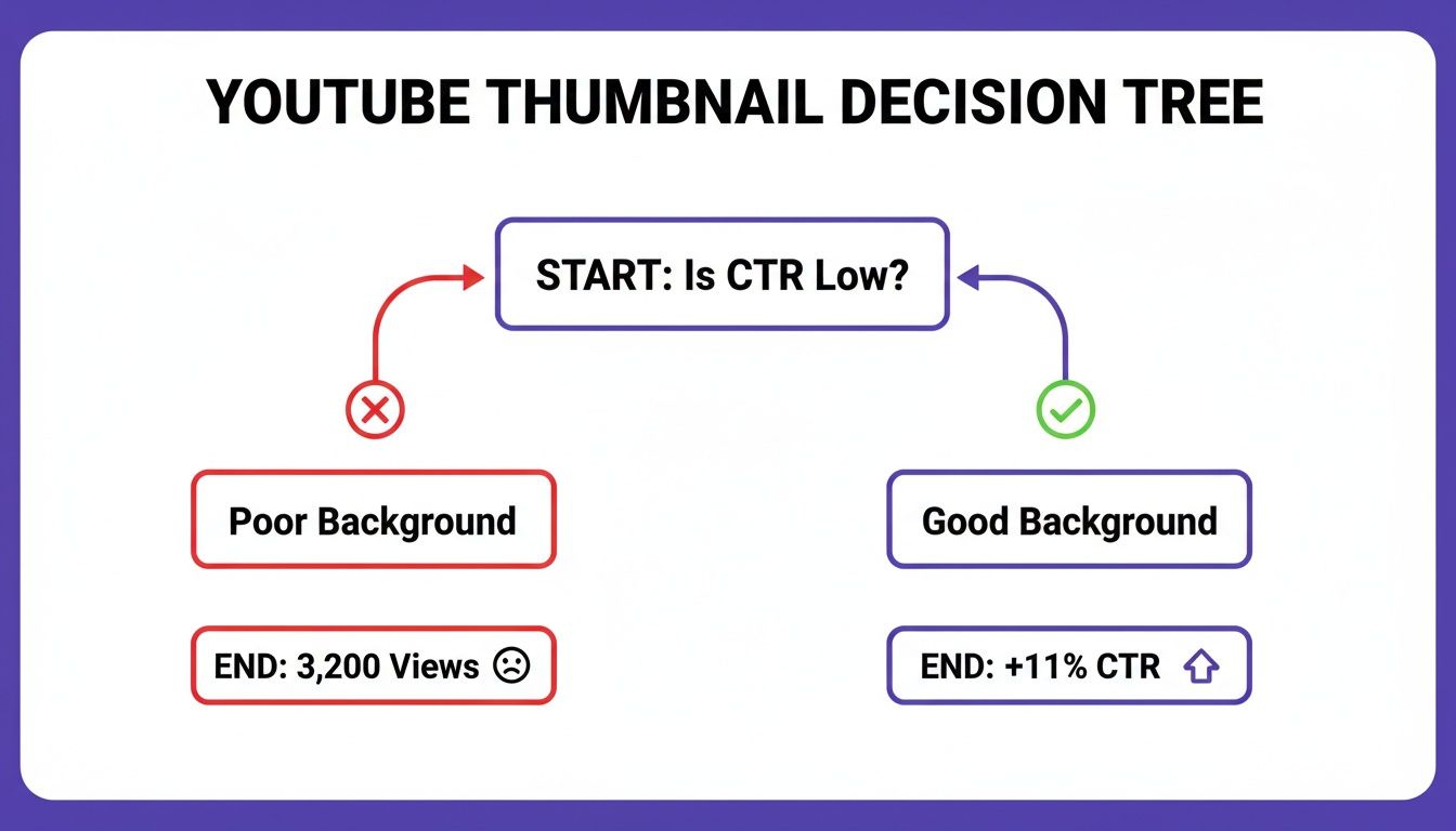
The right choice can lead to an 11% bump in CTR, which is huge. A poor one? It could leave your video collecting digital dust.
To help you decide, let's break down the most common background types and when to use them.
This table gives you a quick-reference guide to see which style might fit your content best. Think about the vibe you're going for and what will make your subject or text stand out most effectively.
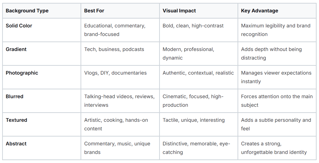
Each of these styles has its own superpowers. Now, let's dive a little deeper into what makes each one tick.
Simple doesn't have to mean boring. In fact, solid color backgrounds are one of the most effective ways to stand out in a cluttered feed. They create a clean, bold look that makes text and subjects pop. This makes them a go-to for educational content, commentary channels, or any video where getting a message across clearly is the top priority. Stick to a consistent color palette, and you'll build brand recognition in no time.
Gradients are the slightly more sophisticated cousin of solid colors. That subtle shift from one hue to another adds a touch of depth and a professional sheen to your design. It feels more dynamic without creating a busy or distracting image. Gradients are super versatile and work beautifully for tech reviews, business presentations, and podcasts.
Want to give your viewers an honest sneak peek? Use a photographic background. Pulling a high-quality still from your video is the fastest way to provide context and show authenticity. This approach is practically essential for travel vlogs, DIY tutorials, and documentaries where the setting is a character in itself. It grounds your thumbnail in reality and tells people exactly what they're getting.
A blurred background is one of the most powerful tools in a creator's toolkit. It instantly separates the subject from the noise, creating a sharp focal point that draws the viewer's eye exactly where you want it to go.
This technique is a shortcut to achieving a high-production, cinematic feel. Blurred backgrounds are incredibly effective for talking-head videos, product reviews, and interviews. By softening the background, you ensure your face, product, or headline is the undisputed star of the show, a must for grabbing attention on a busy homepage.
When you want your thumbnail to have a certain feel, textured backgrounds are a fantastic choice. Subtle patterns like paper, wood grain, or even light static can add a tactile quality that makes your thumbnail more engaging. This style works great for creative content like art tutorials, cooking channels, or anything with a rustic, hands-on vibe.
For creators who want to build a truly unique visual identity, abstract backgrounds open up a world of creative freedom. Bold swirls of color, sharp geometric patterns, or custom digital art can make your thumbnails instantly recognizable. This is the perfect playground for commentary channels, musicians, and anyone aiming to create a brand that is impossible to forget.
Alright, so you know the types of backgrounds out there. But knowing what they are and knowing how to actually use them to get clicks are two totally different things.
Think of these design rules less like strict limitations and more like guardrails on a winding road. They're here to keep your thumbnails focused, clear, and compelling, making sure your creative choices lead to more views, not just more visual noise.
The whole point is to create a clear visual hierarchy. Your background's job is to support the main subject and text, not fight with them for attention. A great thumbnail instantly guides the viewer's eye exactly where you want it to go.
If you only remember one rule, make it this one: contrast. Your main subject and any text absolutely must pop against the background. If someone has to squint to figure out what your thumbnail is about, they're already gone.
Here’s how to nail it:
This is especially critical on mobile, where over 70% of YouTube watch time now happens. We've seen it in the analytics time and time again: thumbnails with high legibility and strong contrast can boost click-through rates (CTR) from a sluggish 6.7% to over 11%.
A thumbnail without a clear focal point is like a sentence without a subject. It's just noise. Your background is the key to establishing what that focal point is.
Your thumbnail is going to show up on everything from a 65-inch TV to a 5-inch smartphone. It needs to look sharp on all of them. Getting the technical specs right isn't just a suggestion; it’s essential for looking professional.
Here are the non-negotiables:
Getting these technical details right from the start means your design shows up exactly as you intended, no matter where it's seen. For a deeper dive into the creative side, check out our guide on how to make great YouTube thumbnails. These core rules are the foundation for building thumbnails that consistently perform well.
Picking a background color for your thumbnail isn't just about what looks good; it's about psychology. The right color choice is a direct line to your viewer's brain, capable of sparking specific emotions and creating powerful associations that can make or break their decision to click. It's the silent language that sets the tone for your content before a single word of your title is even read.
Think of it like this: energetic reds and oranges practically scream "watch me!" and are perfect for high-octane content like vlogs, challenges, or dramatic commentary. On the flip side, calming blues and greens signal trust and authority, which is why you see them so often in educational tutorials, financial advice, or tech reviews. Your color choice is a subconscious cue, telling your ideal viewer exactly what they’re in for.
This isn't just theory; we've got the data to back it up. We’ve seen that high-energy reds and oranges in backgrounds can boost click-through rates (CTR) by a whopping 20-30% for fast-paced niches like vlogs and commentary. And with over 70% of views happening on mobile, bold contrasts like a sharp black gradient with neon accents have led to 10-11% spikes in CTR. On the other hand, outdated pastel backgrounds can leave a video dead in the water, sometimes getting stuck at a painfully low 6.7% CTR. You can dive deeper into these numbers and see how specific colors impact YouTube stats on Thumbnailtest.com.
This kind of data gives us a clear roadmap for designing thumbnails that actually get clicks.
A strategically chosen color palette does more than just look good. It aligns your thumbnail with viewer expectations, boosting trust and curiosity, which are the two key ingredients for a click.
To put this into practice, here’s a quick guide to pairing color palettes with some of the most popular YouTube niches.
When you select colors that match the emotional tone of your video, you’re doing more than just decorating a thumbnail. You're optimizing it based on human psychology to drive real results.
Knowing the theory behind good design is great, but what really matters is putting it into practice without wasting time. This is where modern tools have completely changed the game. What used to be a tedious, technical chore can now be done in just a few clicks, letting you apply pro-level design principles in seconds.
The whole point is to get from a raw video frame to a polished, high-performing thumbnail as quickly as you can. Let's walk through how a dedicated tool makes creating custom backgrounds for thumbnails incredibly simple, handling the grunt work so you can focus on the creative side.
This is a perfect example of how it works. You can see how cleanly a tool can extract the main subject from its original surroundings.
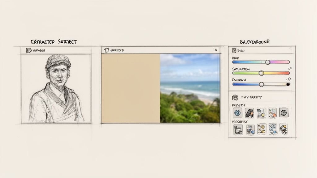
AI automates the most time-consuming part of the process, giving you a clean slate to build a background that truly grabs attention.
It all starts with your video. The tool first pulls the best possible frames for you, analyzing your footage to find clear shots with engaging expressions. Once you have your starting point, turning it into a custom thumbnail is just a simple three-step process.
The big idea here is to start from a nearly finished design, not a blank canvas. This approach speeds up your workflow and ensures every thumbnail you create is built on a solid foundation.
This entire workflow is built for speed. By automating the technical steps, you can try out different backgrounds for thumbnails and find the perfect look in minutes, not hours. If you want to see this in action, you can explore more about AI-generated thumbnails and see how they can fit into your content strategy. It's a method that ensures your final design looks great and is fully optimized to get those clicks.
So you’ve created a background that looks great. That’s a fantastic start, but it’s only half the job. The real key to growing your channel isn't just about making good-looking designs; it's about figuring out what your audience actually wants to click on.
What you think is the perfect background might not be what catches a viewer’s eye. To find out what truly works, you have to stop guessing and start testing. This is where you turn your designs into experiments and let the data guide your way to more views.
The best way to figure out which backgrounds for thumbnails pull in the most viewers is with A/B testing. The idea is brilliantly simple: create two different thumbnails for the same video. Change just one thing, in this case, the background.
For example, you could pit a bold, solid red background against a subtle, blurred photo. You then show each version to different viewers and see which one gets more clicks. This direct head-to-head comparison takes the guesswork out of the equation and gives you hard proof of what your audience prefers.
Don't assume you know what your audience wants. Test your assumptions. The data you get from a simple A/B test is often more valuable than hours of design brainstorming.
By comparing how two backgrounds perform, you can uncover some surprising insights. Maybe a clean gradient gets more clicks than a busy photo, or you might find that a certain color consistently draws more attention. These little discoveries stack up over time, helping you build a proven thumbnail strategy for your channel.
When you’re running these tests, the goal is simple: which background gets more people to click? The single most important number to watch here is your click-through rate (CTR), which you can find right inside your YouTube Analytics.
Think of it like this:
The trick is to get into a rhythm of constant improvement. Post a video with one thumbnail, watch its CTR for a few days, then swap in the second version. Did the click-through rate go up? By testing, tweaking, and repeating, you’ll turn your thumbnails into powerful engines for growth.
Even when you've got a handle on the basics, a few questions always seem to come up. Let's tackle some of the most common ones that creators ask about thumbnail backgrounds.
This is the million-dollar question, but the truth is, there’s no single “best” background. The right choice completely depends on your video’s content and what you want to achieve.
For instance, if you’re doing a talking-head video, a blurred background is a fantastic choice because it makes you, the speaker, pop right off the screen. For tutorials or top-10 lists where text is key, a simple solid color or a clean gradient ensures every word is perfectly readable. Vlogging? Pull a dynamic, high-quality still from your video to give viewers an instant preview of the action.
No matter what, the golden rule is always the same: make sure there’s high contrast between your subject and the background, and have a crystal-clear focal point.
You’ve got a couple of routes you can take here, but for speed, AI-powered tools are a game-changer. They can analyze a photo, identify the main subject, and snip out the background in a flash. Honestly, it saves a ridiculous amount of time.
Think of it this way: using an integrated AI tool for background removal is like skipping all the tedious prep work in cooking. It lets you jump straight to the creative part instead of getting bogged down in manual, pixel-by-pixel editing.
Of course, you can still use traditional software like Adobe Photoshop, but that often means a lot more manual outlining and fine-tuning. For a busy creator who needs to move fast, an automated tool is the clear winner.
This is a great question. While the background image file itself doesn't directly influence your search ranking, its effect on viewer behavior is massive for SEO.
A compelling, well-designed background is what grabs attention and earns the click. It's the key to boosting your click-through rate (CTR). A high CTR sends a huge positive signal to the YouTube algorithm, telling it that people are finding your video highly relevant and engaging for their search.
In response, the algorithm is more likely to show your video to a wider audience, which can seriously boost your rankings and overall visibility. So, in a very real way, your background choice is a critical piece of your SEO puzzle.
Ready to put all this into practice and create thumbnails that actually get clicks? With Thumbnail Maker, you can use AI to instantly remove subjects, swap in the perfect background, and generate designs that are built to perform. Start your 7-day free trial today!


Learn how to grow youtube channel fast with practical strategies to boost growth through content, SEO, and promotion.
Learn how to change thumbnail in youtube from desktop or mobile. Pro tips to boost CTR and revive your videos with eye-catching visuals.
Explore 10 powerful YouTube thumbnail examples from top creators. Learn why they work and how to create your own to increase your channel's click-through rate.