Resources
This is some text inside of a div block.

Your YouTube thumbnail is your video's first impression, a digital billboard competing for attention in a crowded feed. Getting that click isn't luck; it's a science built on psychology, design, and strategy. A high-performing thumbnail can be the single most important factor in a video's success, directly influencing your click-through rate (CTR) and signaling to the YouTube algorithm that your content is engaging.

But what separates a thumbnail that gets ignored from one that demands a click? It comes down to a few key elements: emotional resonance, visual clarity, and a clear value proposition. A viewer must understand what your video is about and why they should watch it in a fraction of a second. A powerful thumbnail accomplishes this instantly, stopping the scroll and earning the view.

In this comprehensive guide, we will break down 10 of the most effective youtube thumbnail examples used by top creators across various niches. We'll move beyond surface-level observations to analyze the specific tactics behind each style, from exaggerated facial expressions and high-contrast text to strategic color blocking and compelling before-and-after formats.

You'll learn not just what works, but why it works. More importantly, we'll provide actionable takeaways and simple steps to replicate these high-CTR designs for your own channel using a tool like Thumbnail Maker. Get ready to transform your thumbnails from simple placeholders into powerful, click-driving assets that grow your audience.

1. Bold Text Overlay with High Contrast

This classic and highly effective technique is one of the most powerful youtube thumbnail examples because it communicates value instantly. The core principle is simple: overlay large, easily readable text on a visually compelling image. By using strong color contrast, the text pops, ensuring viewers can grasp the video's core topic or hook immediately, even on small mobile screens.

This method cuts through the noise of a crowded YouTube feed. Channels like MrBeast master this by pairing a high-stakes concept (e.g., "$1 vs $1,000,000 Hotel Room!") with a visually expressive background. The text isn't just a title; it's the video's entire premise distilled into a few powerful words.

Why This Thumbnail Style Works

  • Clarity at a Glance: Viewers don't need to guess the video's content. The text provides immediate context, answering the crucial question: "What is this video about?"
  • High Readability: Sans-serif fonts like Montserrat, Impact, or Bebas Neue are optimized for screen reading. When combined with high-contrast colors (e.g., yellow text on a dark blue background), they remain legible even at the smallest thumbnail size.
  • Psychological Impact: Bold text creates a sense of urgency and importance. Using numbers, questions, or shocking statements directly in the thumbnail triggers curiosity and compels a click.

Key Strategy: The goal is to make your text so clear that a viewer could understand the video's value proposition without even seeing the image. The image supports the text, not the other way around.

How to Recreate This Style

  1. Select a Compelling Background: Choose a high-quality image from your video that shows emotion or a key moment.
  2. Craft Short, Punchy Text: Limit your text to three to five words. Focus on the most exciting or valuable aspect of your video.
    • Place a solid color block behind the text.
    • Use a thick outline or a drop shadow on the text itself.
    • Choose complementary colors that stand out. Test your design by shrinking it to 130x73 pixels.
  3. Use a Thumbnail Maker: Tools can streamline this process. For instance, you can find a variety of high-contrast text styles and even get inspiration from AI-driven designs. Explore options with an AI-generated thumbnail tool to quickly test different text and color combinations.
  4. 2. Shocked/Exaggerated Facial Expressions

    This powerful technique places a human face with an extreme emotion at the center of the visual narrative. It's one of the most compelling youtube thumbnail examples because our brains are hardwired to notice and interpret faces. By using wide eyes, an open mouth, or an expression of intense shock, creators immediately signal that something extraordinary or unexpected happens in the video.

    This approach creates an instant emotional connection and a powerful curiosity gap. Channels like MrBeast have built empires on this strategy, using close-ups of exaggerated reactions to promise high stakes and unbelievable outcomes. The expression becomes a visual hook, making the viewer desperate to know what caused such a strong reaction.

    A vibrant sketch of a person's face with wide eyes and open mouth, expressing surprise.

    Why This Thumbnail Style Works

    • Emotional Contagion: Viewers subconsciously mirror the emotions they see. A look of shock or excitement in the thumbnail primes them to feel that same emotion, making them more likely to click.
    • Stops the Scroll: In a sea of static images, a highly expressive human face stands out. It breaks the pattern and grabs attention far more effectively than a generic landscape or object.
    • Universal Language: Facial expressions transcend language barriers. Surprise, joy, or fear are understood globally, giving this style a broad appeal and making it effective for international audiences.

    Key Strategy: The face is the focal point. It should tell a story on its own and make a promise to the viewer: "Watch this, and you will feel this same level of surprise or excitement."

    How to Recreate This Style

    1. Plan Your Thumbnail Shot: Dedicate time during your shoot to capture reactions. Ask your subject to react to a key moment, or take still photos specifically for the thumbnail after filming.
    2. Focus on a Close-Up: The face should dominate the frame, ideally taking up more than 50% of the thumbnail. This ensures the expression is clearly visible even on small mobile screens.
      • Slightly increase eye size or whiteness in editing to draw more attention.
      • Use a high-contrast background or a blurred effect to make the face pop.
      • Boost saturation and sharpness on the face to make the emotion feel more intense.
    3. Test Different Expressions: A/B test a "shocked" face against a "happy" or "curious" one. Small changes in expression can lead to significant differences in click-through rate, revealing what resonates most with your audience.
    4. 3. Numbered Lists and Listicle Format

      The listicle format is a proven powerhouse among youtube thumbnail examples because it promises organized, digestible, and high-value information. This technique prominently features a number (e.g., 'Top 10,' '5 Reasons,' '3 Steps') that immediately frames the video's structure. By organizing content into a ranked or sequential list, it creates a "curiosity gap," compelling viewers to click to find out what made the list.

      Sketched steps 1, 2, 3 showing icons of a shopping cart, eye symbol, and another shopping cart.

      This method taps into the human brain's desire for order and predictability. Channels like WatchMojo and BuzzFeed built their empires on this format, transforming simple rankings into a viral video formula. The number itself becomes the primary visual hook, signaling that the viewer will receive a finite set of clear, easy-to-follow points.

      Why This Thumbnail Style Works

      • Sets Clear Expectations: Viewers know exactly what they are getting: a specific number of tips, secrets, or ranked items. This clarity reduces friction and makes the click-through decision easier.
      • Creates Inherent Curiosity: A title like "Top 10 Scariest Movie Scenes" automatically makes the viewer wonder, "What's number one?" This psychological hook is incredibly powerful for driving engagement.
      • High Scannability: A large, bold number is one of the easiest visual elements to process in a crowded feed. It stands out instantly, even on mobile devices, and conveys the video's format in less than a second.

      Key Strategy: The number is the hero of the thumbnail. It should be the largest, most visually striking element. Use the background image and supporting text to provide context for what is being ranked or listed.

      How to Recreate This Style

      1. Choose a High-Impact Number: Select the number that best represents your content (e.g., '7,' '5,' 'Top 10'). Odd numbers often perform well psychologically.
      2. Make the Number Pop: Place the number inside a shape like a circle, square, or banner. Use bold, contrasting colors to make it the focal point of the design.
      3. Provide Visual Context: Use a collage of images or a single compelling background that teases the list's content. For example, a "Top 5 Laptops" video might show a few of the featured devices.
      4. Add Supporting Text (Optional): Include a short, punchy phrase like "BEST GADGETS" or "MISTAKES TO AVOID" to give the number more meaning and enhance the value proposition.

      4. Before and After Split Screen

      This powerful visual storytelling technique is one of the most compelling youtube thumbnail examples for demonstrating transformation. The concept involves dividing the thumbnail into two distinct halves, one showing a "before" state and the other an "after" state. This direct comparison instantly communicates change, progress, or a dramatic result, tapping into the viewer's natural curiosity about the process.

      The split-screen format creates a narrative in a single image. Channels focused on home renovations, fitness transformations, or product upgrades use this to great effect. By presenting the problem and the solution side by side, the thumbnail makes a powerful promise of value: watch this video to see how this incredible change was achieved.

      A side-by-side comparison of a room sketch, transforming from a gray, empty corner to a colorful space with a plant.

      Why This Thumbnail Style Works

      • Instantly Communicates Value: The visual contrast between "before" and "after" immediately shows the benefit of watching the video. Viewers understand they will learn how to achieve a similar transformation.
      • Triggers Curiosity: This format makes viewers ask, "How did they do that?" The desire to understand the journey between the two states is a powerful motivator to click.
      • Highly Versatile: The concept applies to countless niches, including DIY, beauty, fitness, tech reviews (old vs. new model), and even gaming (noob vs. pro).

      Key Strategy: The effectiveness of this thumbnail hinges on the magnitude of the contrast. The more dramatic the difference between the "before" and "after" states, the stronger the psychological pull for the viewer to click and see the story unfold.

      How to Recreate This Style

      1. Capture High-Quality Images: Take clear, well-lit photos or screenshots of both the initial state and the final result. Try to maintain a similar angle and composition for a direct comparison.
      2. Divide the Canvas: In your design tool, create a clear dividing line. This can be a simple vertical line, a colored bar, or a stylized arrow pointing from "before" to "after."
        • Amplify the colors and impact of the "after" image to make it look more appealing.
        • Consider slightly desaturating or dulling the "before" image to enhance the transformation.
        • Add small, clear text labels like "BEFORE" and "AFTER" if the context isn't immediately obvious.
      3. Use a Template: A thumbnail maker can provide split-screen layouts to simplify the process. This helps you focus on selecting the best images and ensures a clean, professional look.
      4. 5. Arrow and Directional Indicators

        This technique uses visual cues like arrows, circles, or even pointing hands to direct the viewer’s gaze. It is one of the most effective youtube thumbnail examples because it physically guides the eye, creating a clear focal point and highlighting the most crucial element in the image. By adding a simple arrow, you remove ambiguity and tell the viewer exactly what they should be looking at.

        This method is incredibly versatile. Tech reviewers use arrows to pinpoint a specific product feature, while gaming channels use them to draw attention to a critical moment in the gameplay. The directional cue acts as a visual command, tapping into our natural instinct to follow pointers and creating an immediate sense of intrigue.

        Why This Thumbnail Style Works

        • Creates a Focal Point: Arrows immediately answer the question, "What is the most important thing in this image?" This is crucial for conveying information quickly in a busy feed.
        • Generates Curiosity: Pointing to something just out of frame or an unexpected element creates a powerful curiosity gap. Viewers click because they need to see what the arrow is indicating.
        • Enhances Clarity: In complex images with multiple subjects, a directional indicator can isolate the video's main topic, ensuring the message is not lost in visual clutter.

        Key Strategy: The arrow should not be an afterthought; it is an active part of the composition. Use it to tell a story by connecting two elements, highlighting a surprising detail, or creating a visual pathway that leads the eye directly to your video's hook.

        How to Recreate This Style

        1. Identify Your Key Element: Choose the single most important object, person, or area in your background image. This is what your arrow will point to.
        2. Choose a High-Impact Arrow: Select an arrow that stands out. Use bright, contrasting colors like red, yellow, or neon green. Add a thick outline or a drop shadow to make it pop.
        3. Position for Maximum Effect: Place the arrow so it leads the eye naturally across the thumbnail. Ensure it points directly at your chosen focal point without obscuring other important details.
        4. Avoid Clutter: Limit yourself to one or two directional cues at most. Overloading the thumbnail with arrows will confuse the viewer and dilute the impact. Test the final design at a small size to confirm it remains clear.

        6. Bright, Solid Color Backgrounds

        This minimalist yet powerful technique is one of the cleanest youtube thumbnail examples because it isolates the subject and eliminates visual distractions. The strategy is straightforward: place your primary subject, whether it's a person, product, or text, against a vibrant, solid-colored background. This creates immediate contrast and ensures the most important elements pop, even on a cluttered homepage.

        This method is highly effective for product-focused and educational channels. Creators like Marques Brownlee (MKBHD) and tech giants like Apple use clean, solid backgrounds to place all the viewer's attention on the technology they are showcasing. The background color itself becomes part of the branding and emotional hook, without adding unnecessary noise.

        Why This Thumbnail Style Works

        • Subject Isolation: A solid background removes competing elements, forcing the viewer's eye directly to the main subject of the video. This is especially useful for product reviews or tutorials.
        • Brand Consistency: Using a consistent palette of two to three solid colors across your thumbnails creates a recognizable and professional brand identity that stands out in subscription feeds.
        • Emotional Connection: Colors have strong psychological associations. A bright yellow can convey energy and optimism, a deep blue can signal trust and professionalism, and a bold red creates urgency.

        Key Strategy: The background isn't just empty space; it's a strategic tool. Use a color that either complements your subject or creates a jarring, high-energy contrast to grab attention and set the video's tone.

        How to Recreate This Style

        1. Isolate Your Subject: Use a tool to accurately cut out your subject from its original background. A clean outline is essential for a professional look.
        2. Choose a Strategic Background Color: Select a solid color that aligns with your brand or the video's mood. Consider colors that contrast well with your subject to make it stand out.
        3. Position and Scale: Place your subject so it occupies a significant portion of the thumbnail, usually over 50%. Add minimal, high-contrast text if needed to provide context.
        4. Simplify with a Thumbnail Maker: Creating this look is fast with the right tools. You can easily remove backgrounds and test different solid color schemes using a dedicated YouTube thumbnail maker, which ensures your design is perfectly optimized for the platform.

        7. Text Callouts and Question Prompts

        This powerful technique leverages human psychology by posing a direct question or a bold statement, creating an immediate curiosity gap. These youtube thumbnail examples excel because they don't just state the video's topic; they frame it as a problem, a mystery, or an unbelievable claim. This prompts the viewer to seek the answer, making a click almost irresistible.

        Creators like MrBeast have popularized this style with prompts like "WILL THIS WORK?" or "CAN WE SURVIVE?" layered over a high-stakes visual. The text acts as a hook, transforming a passive scroller into an engaged viewer who needs to know the outcome. This method is incredibly effective for challenges, experiments, and storytelling content where the result is unknown.

        Why This Thumbnail Style Works

        • Creates a Curiosity Gap: Posing a question triggers a psychological need for an answer. Viewers click to satisfy their curiosity and close the information gap you've created.
        • Sets Clear Expectations: The text immediately tells the viewer the core challenge or premise of the video, promising a payoff or resolution within the content.
        • Drives Emotional Investment: Questions like "CAN I BEAT IT?" or statements like "BIGGEST FAIL EVER" create instant stakes and make the viewer feel invested in the outcome before they even watch.

        Key Strategy: Frame your video's central conflict as a direct question to the audience. The goal is to make them ask, "I need to see how this ends," compelling them to click for the resolution.

        How to Recreate This Style

        1. Identify Your Video's Core Question: What is the main uncertainty or challenge your video resolves? Distill it into a short, impactful question (e.g., "What Happens If?").
        2. Use Visually Strong Punctuation: Make your question marks or exclamation points large and prominent. They act as visual cues that signal an exciting or uncertain premise.
          • Use a bold, sans-serif font that is easy to read on mobile devices.
          • Place the text over a part of the image with less visual noise or add a subtle background shade.
          • Choose a color scheme that makes the text pop against the background image.
        3. Use a Thumbnail Maker: Creating these compelling callouts is simple with the right tool. You can experiment with different fonts, colors, and placements to see what best captures the video's tension. A YouTube thumbnail maker can help you quickly generate and test variations to find the most clickable design.
        4. 8. Branded Logo and Consistent Visual Identity

          Establishing a consistent visual identity is a long-term strategy that turns your channel into a recognizable brand. This technique is one of the most powerful youtube thumbnail examples for building subscriber loyalty because it makes your content instantly identifiable. The core principle is to use the same logo, color palette, and font style across all your thumbnails, creating a cohesive and professional look.

          This approach works like brand packaging on a store shelf. When viewers scroll through their feed, they learn to associate your specific visual style with your content. Channels like MKBHD, with his iconic red and black color scheme and clean aesthetic, have perfected this, ensuring his videos stand out and signal quality before a single click is made.

          Why This Thumbnail Style Works

          • Builds Instant Recognition: A consistent brand identity trains the viewer's eye to spot your videos effortlessly in a crowded subscription feed or on the homepage.
          • Communicates Professionalism: A cohesive visual theme signals that you are a serious creator who invests in quality, which can build trust and authority with your audience.
          • Streamlines Workflow: Having a pre-defined template with your brand elements simplifies the thumbnail creation process, allowing you to produce high-quality visuals more efficiently.

          Key Strategy: The goal is not just to make one thumbnail look good, but to make your entire library of videos look like a unified, professional series. Your brand's visual signature should be as recognizable as a famous logo.

          How to Recreate This Style

          1. Define Your Brand Kit: Choose 2-3 primary brand colors, a highly readable font, and design a simple, memorable logo or icon.
          2. Establish Consistent Placement: Decide on a fixed location for your logo in every thumbnail, such as the bottom-right or top-left corner. This creates a visual anchor.
            • Set up a template file in your preferred design tool with your brand colors, fonts, and logo placement already established.
            • Ensure your logo is visible but does not overpower the main image. Test its clarity at small sizes.
          3. Document Your Guidelines: Keep a simple document outlining your brand rules. This is crucial for maintaining consistency, especially if you work with a team. To learn more about the fundamentals, check out this guide on how to make great YouTube thumbnails.
          4. 9. Contrasting Color Blocking

            This modern design technique uses large blocks of bold, contrasting colors to divide the thumbnail into distinct zones, creating a visually striking and organized layout. Instead of relying on a single background image, color blocking uses geometric shapes to frame different elements, such as a person, a product, or text. This is one of the most effective youtube thumbnail examples for creators who want a clean, graphic, and professional aesthetic.

            Channels focused on design, technology, or modern commentary often use this method to achieve a sophisticated look. For example, a tech reviewer might place a product image in one color block and their own expressive reaction in another, immediately telling a story of comparison or review. The sharp lines and vibrant colors make the thumbnail feel intentional and high-quality.

            Why This Thumbnail Style Works

            • Creates Visual Hierarchy: Color blocking naturally guides the viewer's eye. By placing the most important element on the most dominant color block, you can control where the audience looks first.
            • Enhances Readability: Separating text or key subjects onto solid color backgrounds eliminates visual clutter, making every element easier to process instantly.
            • Modern and Professional Appeal: This style communicates a contemporary and polished brand identity, which is ideal for educational, tech, and business-focused content.

            Key Strategy: Use color psychology to your advantage. Pair colors that evoke the emotion of your video content. For instance, a bright yellow block can signify energy and excitement, while a deep blue block can convey trust and expertise.

            How to Recreate This Style

            1. Plan Your Layout: Decide how you want to divide your canvas. A simple 50/50 vertical or diagonal split is a great starting point.
            2. Choose a Contrasting Color Palette: Use a color wheel to find complementary (opposite) or triadic (evenly spaced) colors for maximum impact. Limit your palette to two or three main colors to avoid overwhelming the viewer.
            3. Isolate Your Subjects: Place cutouts of your subject, product, or key visual elements within the color blocks. Ensure each element has enough space and doesn't feel cramped.
            4. Add Minimalist Text: If you add text, keep it clean and simple. Place it within one of the color blocks where it has the highest contrast and readability.

            10. Comparison and Reaction Format

            This powerful format is one of the most direct youtube thumbnail examples for communicating a video's narrative. It works by placing two or more images side-by-side, creating an immediate story of cause and effect. Typically, this involves showing a creator's expressive reaction next to the object, event, or person they are reacting to.

            The split-screen layout instantly tells the viewer what kind of content to expect: a review, a reaction, a comparison, or a commentary. Channels specializing in music reactions, product reviews, or commentary master this style by pairing their own exaggerated facial expression with a clear image of the subject. This visual shorthand leverages human curiosity about others' opinions and emotions.

            Why This Thumbnail Style Works

            • Instant Storytelling: The side-by-side format creates a clear relationship between two elements. The viewer immediately understands the video is about one thing causing a reaction in another.
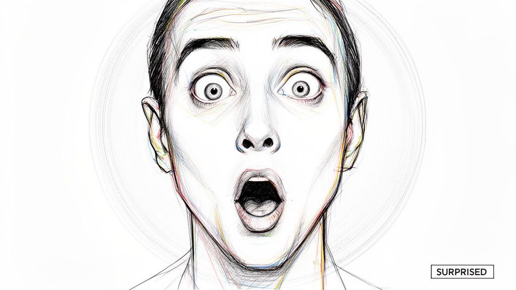
            • Emotional Connection: The reaction face is the emotional hook. Viewers are drawn to strong expressions like shock, joy, or disbelief, making them want to understand the context behind the emotion.
            • Sets Clear Expectations: This style removes all guesswork. A viewer knows they are clicking on a reaction or comparison video, which leads to higher audience satisfaction and watch time.

            Key Strategy: The reaction is the hook, and the subject is the context. Make the facial expression as emotionally charged as possible to create an irresistible "curiosity gap" that makes viewers need to see why you reacted that way.

            How to Recreate This Style

            1. Capture Two High-Quality Images: Get a clear shot of the subject (product, person, etc.) and a separate, high-energy photo of your reaction face.
            2. Create a Clear Division: Use a distinct vertical line, a color shift, or a graphic element to separate the two images cleanly. This ensures the thumbnail doesn't look cluttered.
            3. Prioritize the Reaction Face: Ensure your facial expression is the focal point. It should be well-lit and clearly convey a strong, specific emotion.
            4. Add Minimal Text (Optional): If needed, add a few words like "WOW!" or a question mark to amplify the emotion or context, but let the images do most of the talking. Test the design by shrinking it to ensure both sides remain legible.

            Top 10 YouTube Thumbnail Comparison

            StyleπŸ”„ Implementation Complexity⚑ Resource Requirements⭐ Expected OutcomeπŸ“Š Key AdvantagesπŸ’‘ Ideal Use Cases & Tip
            Bold Text Overlay with High ContrastLow: simple layout, careful typographyLow: basic design tools, font assets⭐⭐⭐⭐: strong CTR for informational contentClear message at small sizes; highly scannableIdeal for educational, informational, curiosity-driven videos. Tip: test readability at 130x73px
            Shocked/Exaggerated Facial ExpressionsLow: photography-focused, selection neededMedium: quality close-up photos, lighting⭐⭐⭐⭐⭐: strong emotional engagement and clicksHighly memorable; draws immediate attentionIdeal for entertainment, reaction, challenge content. Tip: capture multiple genuine expressions
            Numbered Lists and Listicle FormatLow: template-driven layoutLow: simple graphics and numbering assets⭐⭐⭐⭐: effective for ranked/list contentCommunicates structure and value quicklyIdeal for Top 5/Top 10 and comparison videos. Tip: ensure numbers are visible at small size
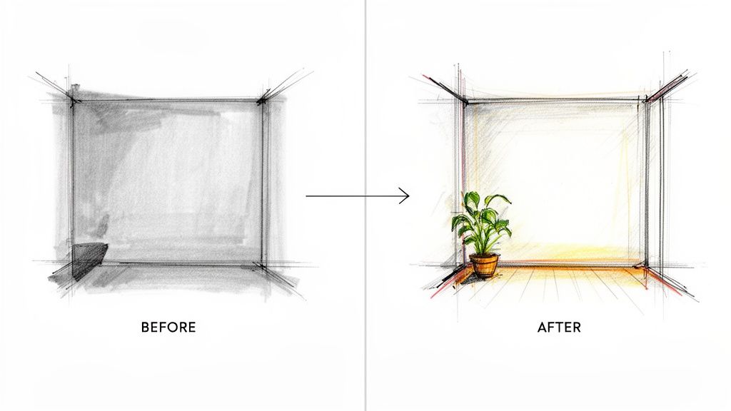
            Before and After Split ScreenMedium: requires balanced compositionMedium: two compelling images or shots⭐⭐⭐⭐: clearly demonstrates transformationImmediately shows change/outcomeIdeal for transformations, renovations, makeovers. Tip: use bold divider/arrow for clarity
            Arrow and Directional IndicatorsLow: simple graphic additionsLow: icon assets or hand graphics⭐⭐⭐: guides viewer attention effectivelyDirects focus; creates motion/urgencyIdeal for product reviews, tutorials, technical demos. Tip: use 1–2 arrows max to avoid clutter
            Bright, Solid Color BackgroundsLow: minimal compositionLow: color selection and subject shot⭐⭐⭐⭐: high clarity and brand polishStrong contrast; consistent, professional lookIdeal for product showcases, tech, minimalist channels. Tip: maintain 2–3 brand colors consistently
            Text Callouts and Question PromptsLow: copywriting + placementLow: typography and layout work⭐⭐⭐⭐: creates curiosity-driven clicksLeverages curiosity gaps to drive CTRIdeal for experiments, challenges, mystery content. Tip: keep text to 5–8 words and deliver answer in video
            Branded Logo and Consistent Visual IdentityMedium: requires brand system setupMedium: logo, templates, color guidelines⭐⭐⭐⭐: builds recognition and loyalty over timeInstant channel recognition; professional consistencyIdeal for established channels and long-term growth. Tip: place logo consistently and test size at thumbnail scale
            Contrasting Color BlockingMedium: design skill for harmonyMedium: color assets and layout templates⭐⭐⭐: striking and modern visual impactBold, memorable graphic aestheticIdeal for design, music, fashion, and creative channels. Tip: limit to 2–4 blocks and use color theory
            Comparison and Reaction FormatMedium: multi-image compositionMedium: reaction shots + subject images⭐⭐⭐⭐: communicates format and drives curiosityShows both reaction and subject contextIdeal for reaction, vs., and product comparison videos. Tip: balance images and use a dividing line for separation

            From Inspiration to Implementation: Your Next Steps

            We have journeyed through a comprehensive gallery of high-performing youtube thumbnail examples, dissecting the strategic choices behind each click-worthy design. From the undeniable visual pull of a "Before and After" comparison to the psychological intrigue of a well-placed arrow, the message is clear: a great thumbnail is not accidental. It is a deliberate, strategic asset engineered to capture attention and drive action in a crowded digital space.

            The core lesson from these examples is that every pixel counts. Your thumbnail is the single most important piece of marketing for your video. It serves as your video's billboard, its book cover, and its first impression all rolled into one. The most successful creators understand this and treat thumbnail creation with the same seriousness they apply to filming or editing. They leverage principles of contrast, emotion, and clarity to communicate value instantly.

            Synthesizing the Core Strategies

            As you move forward, remember the fundamental pillars we've analyzed. Think of these as your strategic toolkit, ready to be deployed for your next video upload:

            • Clarity Above All: Whether using bold text overlays or numbered list formats, your thumbnail must communicate the video's core promise in under three seconds. A confused viewer will not click.
            • Human Connection: Exaggerated facial expressions and direct eye contact create an immediate emotional link. We are hardwired to respond to faces, making them one of the most powerful tools in your arsenal.
            • Visual Guidance: Elements like arrows, circles, and contrasting color blocks are not just decorative. They are directorial cues that guide the viewer's eye exactly where you want it to go, highlighting the most crucial part of the image.
            • Consistency is Key: A branded logo or a consistent visual identity, like using the same color palette or font, builds recognition over time. This transforms a one-time viewer into a loyal subscriber who can spot your content in a packed subscription feed.

            Your Action Plan for a Higher Click-Through Rate

            Inspiration without action is just entertainment. To truly benefit from these youtube thumbnail examples, you must put them into practice. The goal is not to perfectly copy MrBeast or your favorite tech reviewer but to adapt their proven strategies to fit your unique voice and niche.

            Your most valuable ally in this process is data. A/B testing is no longer a luxury reserved for top-tier creators; it is an essential practice for anyone serious about growth. Don't just guess what works. Test it. Create two distinct versions of a thumbnail for your next video. Pit a bright, solid-color background against a more complex in-video scene. Test a version with a question prompt against one with a bold statement.

            These small, incremental tests will provide invaluable insights into your specific audience's preferences. Over time, you will build a deep understanding of what makes your viewers click, allowing you to refine your approach and consistently improve your channel's performance. Every test is a step toward unlocking your content's full potential. The journey from a good CTR to a great one is paved with experimentation.


            Ready to turn these expert youtube thumbnail examples into your own high-performing reality? Stop wrestling with complex software and start creating with Thumbnail Maker. Our AI-powered tool analyzes your content and generates dozens of professionally designed, click-worthy thumbnails in seconds, all based on the proven strategies we've discussed. Take the guesswork out of design and get back to creating great videos by trying Thumbnail Maker today.

Latest Articles

Best Thumbnail Size for YouTube: Master the Right Dimensions for More Clicks

Unlock the best thumbnail size for youtube to boost views. Get exact dimensions and practical tips to create thumbnails that grab attention.

Learn More
5 min read
February 3, 2026
How to grow youtube channel fast: A Proven Playbook

Learn how to grow youtube channel fast with practical strategies to boost growth through content, SEO, and promotion.

Learn More
5 min read
February 9, 2026
A Practical Guide to YouTube Thumbnail A/B Testing

Boost your CTR with this guide to YouTube thumbnail A/B testing. Learn how to plan, run, and analyze tests to get more views and grow your channel.

Learn More
5 min read
February 3, 2026