A Creator's Guide to Adding Chapters to YouTube Video
Learn how adding chapters to YouTube video boosts views and SEO. Our guide covers everything from manual timestamps to AI tools for creators.
Learn More
5 min read
February 9, 2026
Unlock the best thumbnail size for youtube to boost views. Get exact dimensions and practical tips to create thumbnails that grab attention.

Written by:
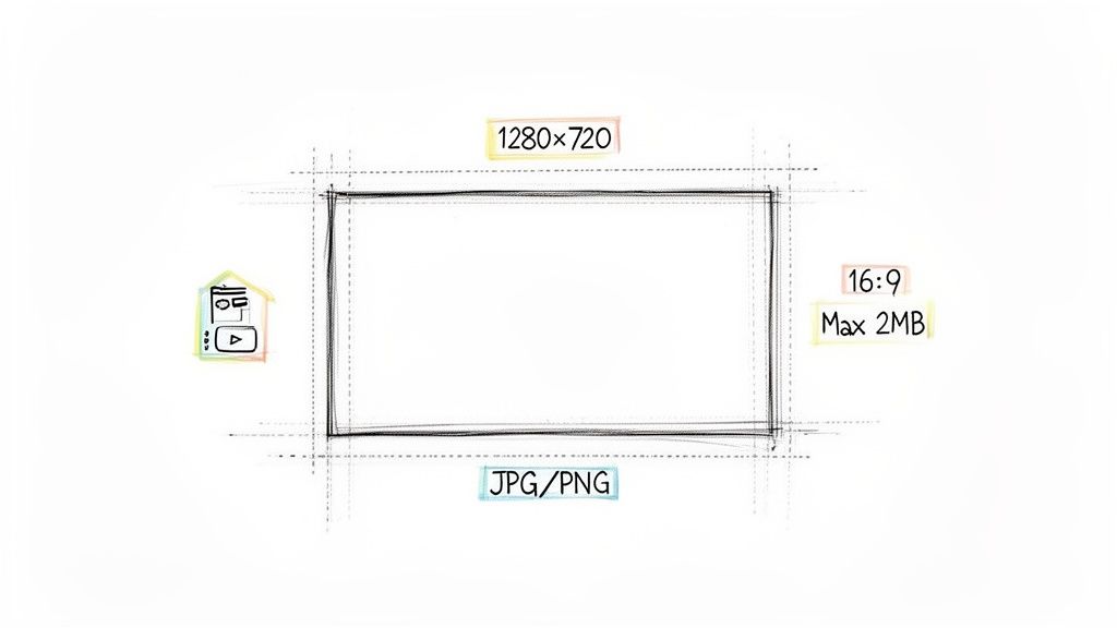
Let’s cut right to the chase: the ideal YouTube thumbnail size is 1280 x 720 pixels.
Why this specific number? Because it perfectly hits the 16:9 aspect ratio, which is the standard for YouTube's video player. Nailing these dimensions from the start means your thumbnail will look crisp and clear everywhere it shows up, from a massive smart TV screen right down to a tiny smartphone display. No weird stretching, no ugly black bars, just a professional-looking image that invites people to click.
Think of your thumbnail as a mini-movie poster. It's the very first thing people see, and in a split second, they decide whether to watch your video or scroll right past it. Getting the technical specs right isn't just about ticking boxes for YouTube's algorithm; it’s about making a powerful first impression that works for you, not against you.
A sharp, well-composed thumbnail screams quality and professionalism, building instant trust. The goal is an image that’s detailed enough to look great on a big screen but still bold and readable when it’s shrunk down on a mobile feed. If you ignore the official guidelines, you risk a blurry, pixelated, or poorly cropped image that can kill your click-through rate (CTR) before your great content ever gets a chance.
YouTube lays out these rules for a reason: they guarantee a consistent, high-quality experience for viewers across the board. These specs haven't changed much over the years because they simply work. This is especially true on mobile, where over 70% of all YouTube watch time happens and thumbnails compete for attention in a very small space. You can find more creator insights on YouTube's thumbnail requirements.
Here are the four pillars of a technically perfect thumbnail:
Mastering these four simple specs is the first step. It sets the foundation for a successful video before anyone even hits the play button.
For a quick reference, here’s a breakdown of the essential technical specs you need to know. Sticking to these guidelines ensures your thumbnail will always look its best.
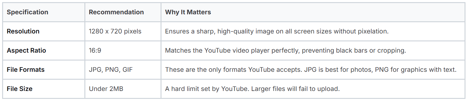
Think of this table as your pre-flight checklist. Running through it before you upload guarantees you avoid any technical hiccups that could hold your video back.
Think of your YouTube thumbnail as a book cover or a movie poster. It’s the very first thing people see, and in that split second, they decide whether to click play or just keep scrolling. Getting the dimensions right isn't just about ticking a technical box; it’s the foundation of your video's first impression and a massive driver of your channel's success.
A sharp, perfectly sized thumbnail immediately screams professionalism. It builds trust. When a potential viewer sees a crisp image that fits the frame just right, it sends a subconscious signal: you care about quality. That small detail is often enough to make them choose your video over a competitor's blurry, awkwardly cropped one.
But this is about more than just looking good. It’s about playing the game and giving the YouTube algorithm exactly what it wants. YouTube’s main goal is to keep people on the platform, so it’s constantly on the hunt for signals that a video is worth watching. A high click-through rate (CTR), fueled by a compelling thumbnail, is one of the most powerful signals you can send.
When lots of people click on your video, you’re telling YouTube, "Hey, people want to see this!" The algorithm takes that feedback and starts showing your video in all the right places: the homepage, top of search results, and that all-important "Up Next" sidebar. Nailing the best thumbnail size for YouTube is a strategic move, not just a tiny detail.
A well-sized thumbnail is your video's best advocate. It telegraphs quality to viewers and proves value to the algorithm, kicking off a powerful cycle of clicks, views, and channel growth.
The link between proper sizing and channel growth is direct and easy to see. Channels that consistently nail their thumbnail dimensions tend to see sustained growth simply because the algorithm rewards high-CTR content with more visibility. These HD specs are also crucial for global audiences in places like the US and India, ensuring your thumbnails look great and load fast, even on slower connections. You might also be interested in how your video's title can work with your thumbnail to maximize clicks at https://thumbnailmaker.studio/features/title-tags.
Get the specs wrong, and your video might as well be invisible. Get them right, and the results can be huge. In fact, we've seen channels that seriously optimize their thumbnails boost their views by 20% or more. That’s the power of a great first impression. For a deeper dive, SocialRails.com has a great analysis on how these specs directly impact channel performance. It’s a simple technical step that turns a casual scroll into a committed view and maybe even a new subscriber.
Nailing the technical specs of your thumbnail is more than just checking boxes. It’s about understanding why these numbers matter. When you get the details right, you’re not just following rules; you’re setting your video up for success by making sure your thumbnail looks perfect everywhere on YouTube, from a giant TV screen to a tiny phone.
Think of the 16:9 aspect ratio as the native language of video. It's the standard widescreen shape that nearly every modern screen uses. When your thumbnail matches this ratio, it fits perfectly inside YouTube's video player, like a key made for a specific lock. This simple step prevents those ugly black bars from showing up, which instantly makes your content feel more professional and polished.
When it's time to save your masterpiece, you'll usually face a choice between JPG and PNG. Each one has its strengths, and the key is to balance visual quality with file size, remembering that YouTube has a hard limit of 2MB.
Here’s a simple breakdown to help you decide:
A good way to think about it is that JPGs are like blended oil paintings, while PNGs are like sharp, precise vector illustrations. Choosing the right one ensures your thumbnail looks exactly how you intended.
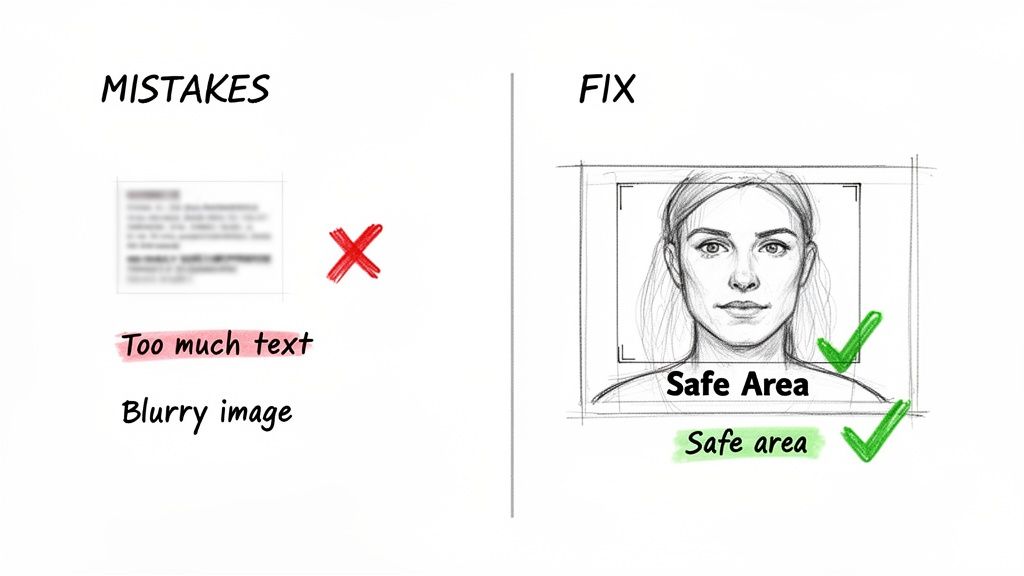
The 'safe area' is your secret weapon for a foolproof thumbnail. By keeping critical elements out of the corners, you guarantee YouTube's interface won't cover up your message.
One of the most common mistakes I see is creators forgetting about the thumbnail safe area. This is the central portion of your image that’s guaranteed to be visible on any device. YouTube loves to overlay its own interface elements, and they can easily block key parts of your design.
For instance, the video's timestamp almost always covers the bottom-right corner. If you’ve placed your face, your product, or a crucial bit of text there, it’s going to be hidden.
The fix is simple: always keep your most important visuals, like your face, the main subject, and text, centered and away from the edges. Making this a habit ensures your thumbnail does its job effectively, no matter where someone sees it. It’s one of those little details that separate good thumbnails from great ones. You can even learn more about AI-generated thumbnails and see how modern tools automatically account for these safe zones.
What looks amazing on a huge desktop monitor can turn into a blurry, unreadable mess on a smartphone. The real secret is to design for every possibility, making sure your image is just as compelling on a 65-inch smart TV as it is in a fast-scrolling mobile feed. Sticking to the ideal YouTube thumbnail size, 1280 x 720 pixels, gives you the perfect canvas to make that happen.
Think about it like designing a billboard. You’ve got just a split second to grab someone’s attention as they drive past, so you use big, bold, and simple elements. It’s the exact same principle for someone scrolling through their YouTube feed. Your thumbnail has to instantly communicate what your video is about, no matter how small it is.
This flowchart breaks down the essential specs you need to get right for a thumbnail that just works everywhere.

As you can see, getting the aspect ratio, file format, and "safe area" right forms the technical foundation of a design that won’t let you down on any device.
Even though a high-resolution image is key for looking great on a giant TV, you have to design for mobile first. A massive chunk of all YouTube views happens on phones, so if your thumbnail fails there, it fails everywhere.
To nail your mobile design, you really only need to focus on three things:
This mobile-first approach ensures your thumbnail is visually punchy and makes sense, even when it's competing with a dozen other tiny images on a screen.
Of course, designing for mobile doesn't mean forgetting about larger displays. YouTube recently upped its file size limit from 2MB to a whopping 4MB, a clear signal they want creators to improve the viewing experience on smart TVs. While the 1280 x 720 pixel dimension is still the standard, the larger file size means you can use much higher-quality images that won't look pixelated on a 4K screen.
The key takeaway is simple: always start with the highest quality image you can get. A sharp, well-lit photo scales down perfectly for mobile while holding onto all the crisp detail needed for a cinematic TV experience.
By focusing on bold, simple designs built from high-resolution source files, you create one thumbnail that works everywhere. For more hands-on design advice, check out our guide on how to make great YouTube thumbnails. This universal approach guarantees your video's first impression is a powerful one, no matter where your audience is watching.
You could have the most incredible video in the world, but a few simple thumbnail mistakes can stop it dead in its tracks. I've seen countless creators unknowingly sabotage their own work with these totally preventable errors, killing their click-through rates before anyone even gives the content a chance.
Getting a handle on these common pitfalls is the first step. This isn't just about following rules; it's about making sure your video's first impression is a powerful one.
Honestly, this is one of the most damaging mistakes you can make. A blurry or pixelated image just screams low-quality. This usually happens when someone uploads a picture smaller than the recommended 1280 x 720 pixels. YouTube then has to stretch that small image to fit, and all the sharpness just vanishes.
The fix is easy: always start with a high-quality, high-resolution source image. Pulling a still frame from your 1080p or 4K video is a far better move than using a tiny, fuzzy screenshot. A crisp image instantly tells viewers you're a professional and makes your content look way more appealing.
A great video hidden behind a bad thumbnail might as well not exist. Avoiding these simple mistakes ensures your thumbnail works for you, not against you, inviting viewers to see the great content you've created.
Think of your thumbnail as a billboard, not a book cover. Trying to cram a paragraph of text onto it is a guaranteed way to make it unreadable, especially on the tiny mobile screens where most people watch YouTube. A viewer needs to get the gist in a split second, or they're gone.
This simple approach makes sure your message hits home immediately, even when the thumbnail is no bigger than your thumb.
This one trips up a lot of new creators. They place key elements, like their face or important text, right up against the edges. But then YouTube slaps its own interface on top, like the video length timestamp in the bottom-right corner, and suddenly your hard work is completely covered up.
To avoid this, always keep your most important visual information centered in the thumbnail. This is what we call the safe area. It’s the visual real estate you can count on being visible. Creators who pay attention to this not only see better engagement but often report faster upload success. If you want to dive deeper, you can discover more insights about thumbnail best practices and see just how much it impacts performance.
Let's wrap up with a few quick answers to the questions I hear most often from creators trying to nail their thumbnail specs.
You bet. While YouTube's official recommendation is 1280x720 pixels, uploading a full HD image (1920x1080) works perfectly. In fact, it's often a good idea.
As long as you stick to that crucial 16:9 aspect ratio and keep the file under 2MB, YouTube will handle the rest. It simply scales the larger image down, which can result in a sharper, crisper thumbnail than if you started with the minimum size.
This is a classic and frustrating problem. A blurry thumbnail is almost always the result of uploading an image that’s smaller than the recommended 1280x720 pixels.
When you give YouTube a small image, it has to stretch it out to fit the standard display areas. That stretching process is what causes the pixelation and loss of quality. Always, always start with a high-resolution image to keep things looking sharp.
The golden rule for YouTube thumbnails is the 16:9 aspect ratio. This is the standard widescreen format that matches the video player itself, guaranteeing your thumbnail looks professional without any weird cropping or black bars.
Yes, and this is a big one that trips people up. Even though Shorts themselves are vertical (9:16), the custom thumbnail you upload needs to be a standard horizontal 16:9 image (1280x720).
Why? Because that horizontal thumbnail is what people see everywhere except the Shorts feed. It shows up on your channel page, in search results, and on the YouTube homepage. It’s your main tool for getting viewers to click, so don't skip it!
Tired of battling with design tools? Let AI take care of it. Thumbnail Maker can generate click-worthy thumbnails in seconds, giving you more time to create. Start your free trial and see the difference.


Learn how adding chapters to YouTube video boosts views and SEO. Our guide covers everything from manual timestamps to AI tools for creators.
Master the YouTube thumbnail preview process to test your designs, avoid common mistakes, and significantly boost your video's click-through rate (CTR).
Boost your CTR with this guide to YouTube thumbnail A/B testing. Learn how to plan, run, and analyze tests to get more views and grow your channel.