Learn how to grow youtube channel fast with practical strategies to boost growth through content, SEO, and promotion.
A solid YouTube thumbnail preview is your secret weapon. It’s the final quality check that catches critical flaws before you hit publish, ensuring your design actually works where it matters: on mobile, desktop, and TV screens.
This isn’t just a nice-to-have; it's a non-negotiable step. It forces you to switch hats from creator to viewer, letting you spot issues like illegible text or weak color contrast that could silently kill your video's potential and cost you thousands of views.
Stop thinking of your thumbnail as just an image. It's the single most important piece of marketing for your video, a digital billboard fighting for eyeballs on a crowded YouTube homepage. If you skip the preview, you’re flying blind.
A quick preview instantly reveals problems that are painfully obvious to a viewer but easy for a creator to miss when they're deep in the editing zone. What looks brilliant on your big design monitor can easily become a blurry, unreadable mess on a tiny smartphone screen.
The whole point of a preview is to see your thumbnail through a fresh set of eyes. You need to see it in its natural habitat: a noisy, distracting feed filled with other options. This simple shift helps you answer the tough questions that will make or break your click-through rate.
Your thumbnail isn't supposed to be a perfect work of art. Its only job is to perform. It has to scream value, create curiosity, and convince someone to choose your video over all the others.
Getting into the habit of previewing is even more critical when you remember how people watch YouTube today. Yes, the official recommended size is 1280 x 720 pixels (a 16:9 aspect ratio) to avoid distortion, but the real test is on a small screen.
With over 70% of YouTube watch time now happening on mobile devices, your design must be clear and compelling at a tiny size. If it isn't, you're ignoring the vast majority of your potential audience. For a deeper dive, check out these best practices for thumbnail sizing to get every detail right.
Ultimately, a smart YouTube thumbnail preview process is all about performance. It’s a strategic gut-check that ensures all your creative effort actually translates into clicks and views. You can learn more about how to make great YouTube thumbnails in our complete guide. Now, let’s get into the nitty-gritty of how to preview your work in every context.
A brilliant thumbnail idea can fall completely flat if you don't check how it actually looks where viewers will see it. A real YouTube thumbnail preview isn't just about admiring the finished image file on your computer; it's about road-testing it in the wild. You need to see how it performs on different screens and across all the places YouTube will show it.
This process is all about checking how your design scales, competes, and communicates in every possible environment. What looks incredible on your 27-inch editing monitor can easily turn into an unreadable, blurry mess on a smartphone, which is where a massive chunk of your audience will first lay eyes on your video.
Your viewers are on phones, laptops, and even TVs, so your preview process has to cover all the bases. The main goal here is to spot scalability issues. You want to make sure your text, your face, and any key visuals stay punchy and clear, no matter the size.
I see it all the time: creators design for their big, beautiful desktop monitors and completely forget about the mobile experience. If your thumbnail isn't instantly compelling on a phone, you're just throwing potential views away.
Where a viewer sees your thumbnail is just as important as what they see. On the homepage, it's a battle for attention against a dozen other videos. In search results, it has to scream "this is the answer to your question." Creating mockups for these different pages is a pro-level technique that pays off big time.
This simple workflow really drives home how designing, previewing, and analyzing performance are all part of the same loop.
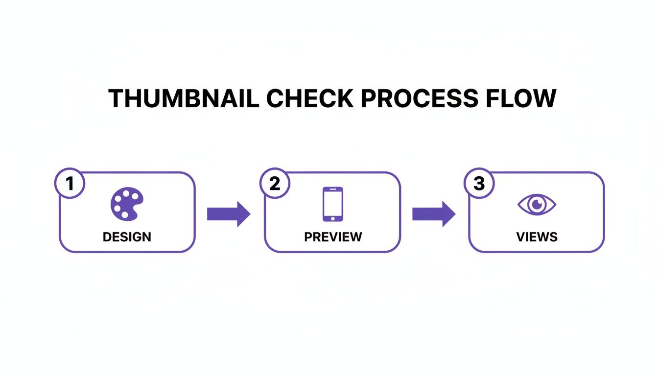
As you can see, that preview step is the crucial bridge between your creative concept and how it actually performs in the real world.
A super effective way to create these mockups is to just take a screenshot of the YouTube app or website and slap your thumbnail design over an existing one. This "in-situ" preview helps you answer the tough questions before you publish.
Doing these checks ensures your design isn't just a pretty picture. It's a high-performance asset built to be legible, eye-catching, and compelling, no matter how someone stumbles upon your content.
Use this quick reference to make sure your thumbnail is ready for every viewing context before you hit publish.
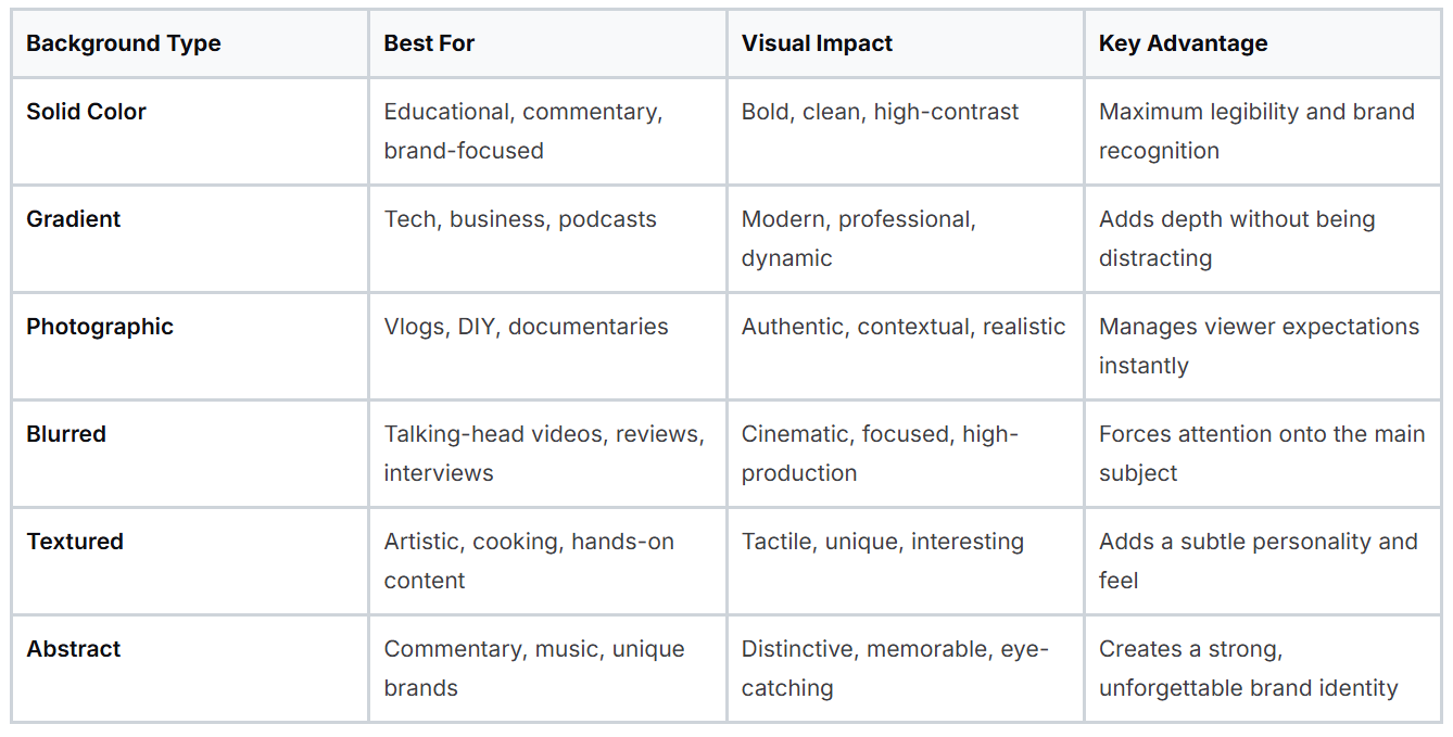
By running through this checklist, you're not just hoping your thumbnail works; you're making sure of it. It’s a small time investment that can make a huge difference in your video's reach and impact.
While mockups and third-party tools are great for getting a feel for your design in the wild, there's no substitute for seeing it in its natural habitat. The YouTube thumbnail preview inside YouTube Studio is your most important checkpoint. This is where your thumbnail goes from a simple image file to a real part of your video package.
When you're uploading a new video, you'll land on the "Details" page. Once your video has processed, YouTube will offer you three auto-generated frames to use as a thumbnail. My advice? Ignore them. A well-designed custom thumbnail will outperform those blurry, awkward stills 99% of the time.
Just below those options, you'll find the "Upload thumbnail" button. This is your moment of truth. Go ahead and upload your design, and Studio will immediately show it to you in context, right next to your video's title.
Don't just upload and move on. This preview is your final chance to catch any glaring issues before your video goes live. Seeing your thumbnail paired with your title is critical because that’s exactly how viewers will see it.
Take a second to ask yourself some honest questions:
The YouTube Studio preview is your final gut check. It’s where your design stops being an isolated graphic and starts working as part of a team with your title. Pay very close attention to how they play together.
Now, for those with access, YouTube has a game-changing feature that takes this a step further. The "Test & Compare" tool is the platform's own built-in A/B testing system, and it’s a goldmine for data.
You'll find it right under the thumbnail options. This tool lets you upload two different thumbnails for the same video. YouTube then splits your audience, showing one version to half and the second version to the other half.
Over a period of up to two weeks, it tracks performance and eventually crowns a winner based on which thumbnail drove a higher share of watch time. It's the ultimate way to let your audience vote with their clicks.
Even if you don't have this feature yet (it's still rolling out), its existence proves just how critical thumbnails are to YouTube. It validates that tweaking colors, fonts, or images can have a massive impact, making that initial preview in Studio more important than ever.
Let’s be real: manually creating and previewing multiple thumbnail versions for every single device and YouTube layout is a massive time-drain. It’s effective, sure, but it can seriously slow down your publishing schedule. This is exactly where specialized tools come into play, handling the grunt work so you can focus on the creative side of your YouTube thumbnail preview process.
A dedicated thumbnail maker is designed from the ground up to generate multiple, high-contrast designs based on what’s actually proven to work on the platform. These tools often build best practices for color, composition, and text legibility right into their suggestions. This gives you a powerful starting point that helps you sidestep common mistakes right out of the gate.
This image shows the kind of early-stage brainstorming that a good tool can help you accelerate.
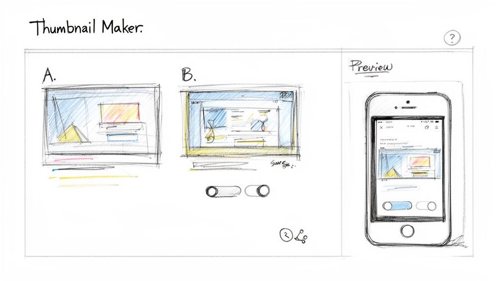
It's that jump from a rough sketch to a polished digital preview where these tools truly save creators the most time and effort.
One of the biggest wins you get from these tools is the built-in preview and testing functionality. Instead of painstakingly creating mockups yourself, you can see how your designs will actually look in different contexts with just a click. This makes it possible to visualize a handful of options instantly and make faster, more confident decisions.
Imagine you're making a video about a new camera. A thumbnail maker might generate two completely different concepts for you:
Instead of blocking out an hour to build both from scratch, you can have these options in minutes. From there, you could even fire off a quick screenshot of the previews to a trusted group on Discord or a colleague to get some instant feedback before you commit. Integrating design and preview into one seamless workflow saves hours and simply leads to better thumbnails. You can learn more about how to create compelling AI-generated thumbnails with modern tools.
The goal is to shift your mindset from finding one "perfect" idea to quickly testing several good ideas. A thumbnail maker facilitates this by making the cost of experimentation nearly zero.
At the end of the day, every design choice you make serves one purpose: earning the click. A solid YouTube thumbnail preview is your final check, but the design itself is what drives your click-through rate (CTR).
The average CTR on YouTube hovers between 4% and 10%, with most creators shooting for that 5-10% sweet spot. Think about it: a creator with 100,000 monthly impressions and a 4% CTR gets 4,000 clicks. But if they can boost that to 8%, they've just doubled their traffic to 8,000 clicks from the exact same audience.
By using a tool that generates proven designs, you’re not just making pretty pictures. You’re building an asset engineered to hit those higher CTR numbers. You can discover more insights about YouTube performance benchmarks straight from the source.
A good YouTube thumbnail preview helps you make an educated guess, but data-driven A/B testing gives you a definitive answer. Think of it this way: previewing helps you spot the obvious mistakes, but testing is what truly takes the guesswork out of the equation. It's the critical leap from "I think this looks good" to "I know this performs better."
The concept behind A/B testing is pretty straightforward. You create two different thumbnails (an 'A' version and a 'B' version) and show them to different segments of your audience. The goal is simple: see which one pulls in a higher click-through rate (CTR). This process reveals what your viewers actually respond to, and the results can be genuinely surprising, often challenging your own creative instincts. I've seen a minor tweak in an on-screen expression, a different background color, or a tiny change in text completely transform a video's performance.
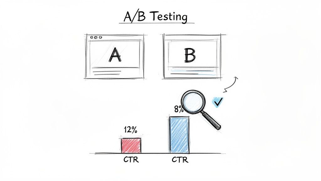
You don’t necessarily need a bunch of expensive tools to start testing. There are a few different ways to gather data, from using YouTube’s own features to running some simple manual experiments. The most important thing is to make sure the thumbnail is the only thing you're changing.
Here are a few common approaches people use:
The real goal here isn't just to find one winning thumbnail. It's to learn what design elements (colors, fonts, expressions, layouts) consistently connect with your audience. That knowledge is what helps you make smarter creative decisions on every single video you upload from here on out.
The results you can get from disciplined testing are nothing short of massive. For any creator trying to grow their channel, it’s one of the highest-leverage things you can do. Even a tiny improvement in your CTR can compound over time, leading to huge gains in views and overall channel growth.
In my experience, a successful A/B test can improve CTR by anywhere from 20% to 50%, depending on where you're starting from and what your niche is. Even a seemingly small 0.5% CTR improvement can mean thousands of extra views every month for a channel getting a lot of impressions. If you want to dive deeper, you can discover more insights about these YouTube experiments and their impact.
Ultimately, moving beyond a basic YouTube thumbnail preview to a consistent testing strategy is what separates amateurs from the pros. It’s how top creators turn their channels into reliable growth engines by taking the guesswork out of their most important marketing asset and putting cold, hard data in the driver's seat.
Even with a solid plan, you're bound to have questions about the finer points of previewing and testing thumbnails. Getting those questions answered is what separates the creators who guess from the ones who know. Let's dig into some of the most common questions I hear about the whole youtube thumbnail preview process.
We'll cover how to spot a winning design before you hit publish, the best ways to check your work on mobile, and what to do about testing and updates.
This is the million-dollar question, isn't it? Your best bet is a solid preview routine that puts your thumbnail through a few critical stress tests.
First, you have to see how it looks at different sizes. What’s clear on your big desktop monitor can become a blurry mess on a tiny phone screen. Next, take a screenshot of it and drop it right next to the thumbnails of top-performing videos in your niche. Does it pop with bold colors and a clear focal point, or does it just fade into the background?
The final, and most important, gut check is this: does the thumbnail make you curious? Does it clearly promise what the video is about? A truly great thumbnail nails all three of these points, telling a viewer your video is the one they should click on.
The simplest method is often the best. Just send the thumbnail image file to your phone and open it in your photo gallery. This gives you a real-world feel for how it holds up on the small screen, which is where most of your audience will see it first.
If you want to take it a step further for a super-realistic preview, here's a pro tip: screenshot the YouTube app's homepage or subscription feed. Then, use a basic photo editor to paste your new thumbnail design over one of the existing videos. This is the ultimate test, as it shows you exactly how your design will look and compete for attention in a cluttered, fast-scrolling feed.
Absolutely. While YouTube's built-in "Test & Compare" feature is a great tool, you can still run powerful tests on your own. A classic and effective way is to publish your video with 'Thumbnail A' and keep a close eye on its click-through rate (CTR) in YouTube Analytics for the first 48-72 hours.
Once you have that baseline data, swap it out for 'Thumbnail B' and track its CTR for the same amount of time. Look, it’s not a perfect, lab-controlled experiment, but comparing the performance data between those two periods will give you a surprisingly clear picture of which design your audience actually responds to.
For a brand-new video, you've got to be patient. Give the original thumbnail at least 48 to 72 hours to breathe. This window gives the YouTube algorithm enough time to push it out to viewers so you can get reliable data on its click-through rate. Changing it too soon means you're acting on incomplete information.
The game changes for your older, evergreen content, though. If you've got a video that's been sitting with a low CTR (say, under 4%) for a while, swapping the thumbnail is one of the smartest things you can do. A fresh thumbnail and maybe even a tweaked title can be just the thing to give that video a second life and catch the algorithm's attention all over again.
Ready to stop guessing and start creating thumbnails that get more clicks? With Thumbnail Maker, you can generate multiple high-performing designs in seconds, A/B test your ideas effortlessly, and streamline your entire publishing workflow. Start your 7-day free trial and see the difference data-driven design can make for your channel at https://thumbnailmaker.studio.

Learn how to grow youtube channel fast with practical strategies to boost growth through content, SEO, and promotion.

Struggling to increase your YouTube watch time? Learn proven strategies to boost audience retention, optimize content, and master the YouTube algorithm.
Explore 10 powerful YouTube thumbnail examples from top creators. Learn why they work and how to create your own to increase your channel's click-through rate.