A thumbnail is that small, static image you see representing a video. Think of it like a book cover or a movie poster, but for your digital content. Its entire job is to catch someone's eye and convince them to click play.
Unpacking the Power of a Single Image
At its heart, a thumbnail is your video's very first impression. On a crowded platform like YouTube, where countless videos are competing for attention, your thumbnail acts as a powerful visual sales pitch.
Before anyone even reads your title, they see that image. In a split second, it has to communicate what your video is about, its tone, and why someone should care. It’s not just a placeholder; it’s arguably the single most important factor in getting people to click.
This little graphic is your content's frontline marketing. A great thumbnail can mean the difference between a video that racks up thousands of views and one that gets completely lost in the noise. It silently promises the viewer an answer, a story, or a solution, all through a single, well-designed image.
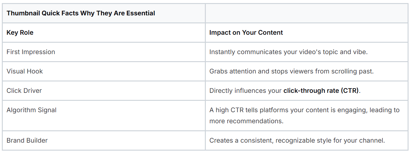
To really drive this home, here's a quick look at why thumbnails are so critical.
Essential Thumbnail Facts
As you can see, this one small image carries a lot of weight for your video's success.
The Foundation of Viewer Engagement
Ultimately, knowing what a thumbnail is means understanding its direct impact on your click-through rate (CTR). This is a simple but vital metric: it measures the percentage of people who see your thumbnail and actually click on it.
A high CTR is a powerful signal to platforms like YouTube. It tells the algorithm that people are interested in your content, which in turn can lead to your video being pushed out to a much wider audience.
A great thumbnail bridges the gap between a potential viewer and an active subscriber. It turns passive scrolling into an active decision to engage with your content.
This is exactly why top creators pour so much effort into their thumbnail strategy. They understand that even a masterpiece of a video will go unwatched if the "storefront" isn't enticing enough to bring people inside. The visual language you use here sets expectations and kicks off the entire viewer journey.
For creators serious about growing their audience, mastering thumbnail creation is non-negotiable. You can learn more about how creators can build an effective content workflow and explore tools designed to help. Think of it this way: your thumbnail is the silent ambassador for your video, working 24/7 to attract your ideal audience before they ever hear a single word you have to say.
The Anatomy of a High-Performing Thumbnail
Ever wonder what separates a thumbnail that gets all the clicks from one that just gets scrolled past? It's not luck. A high-performing thumbnail is a meticulously crafted visual hook, built from a few specific ingredients proven to grab attention and make people click.
Think of these elements as the building blocks for a powerful first impression. The best thumbnails combine raw emotion, punchy text, and smart color choices to create a preview that's simply too good to ignore. Once you understand this anatomy, you're on your way to creating images that pull in viewers every single time.
Emotion Sells the Story
If you only remember one thing, make it this: the most powerful element you can put in a thumbnail is a human face showing a strong, clear emotion. We are hardwired to connect with faces. An expressive reaction, whether it's shock, joy, or intense curiosity, acts like a universal shortcut, instantly telling the viewer what kind of experience they’re in for.
A picture of someone with a jaw-dropped, surprised expression signals that something wild is about to happen. A huge, genuine smile promises a fun, positive video. This emotional connection is made in a split second, long before someone even bothers to read your title. That makes it your most important tool for stopping the scroll.
Text That Demands Attention
While an emotional face gets them to pause, the text gives them a reason to stay. The trick here is to use as few words as possible for the biggest impact. A handful of bold, easy-to-read words can spell out the video's main promise or create a burning question in the viewer's mind.
Steer clear of tiny, fussy fonts that are impossible to read, especially on a small phone screen where most people will see it. Your goal isn't to write a summary. It's to slap a powerful keyword or question on the image that works with the visual. Something like “SECRET UNLOCKED” paired with a curious face is infinitely more compelling than a full sentence trying to describe the video.
A great thumbnail answers an unspoken question in the viewer's mind. It uses visuals and text to signal that your video holds the solution, story, or information they are looking for.
The Power of Color and Branding
Color psychology is a huge piece of the puzzle. It’s what makes your thumbnail pop in a sea of other videos. High-contrast pairings, like a bright yellow against a deep blue, are visually arresting and hard to miss. Colors also carry their own emotional weight; red can create a sense of urgency or excitement, while green might suggest growth or money.
You can see how these pieces fit together to essentially create a "storefront" for your video, designed to grab attention and drive that all-important click.
It’s not just about one-off designs, either. Using consistent branding elements like a small logo, a signature font, or a specific color scheme helps build recognition for your channel. When your audience can spot your content instantly in their feed, they’re far more likely to click, helping you build a loyal following over time. By mastering these core components, you're not just making a pretty picture; you're creating a powerful visual engine that consistently brings in viewers.
Mastering Thumbnail Specs and Platform Rules
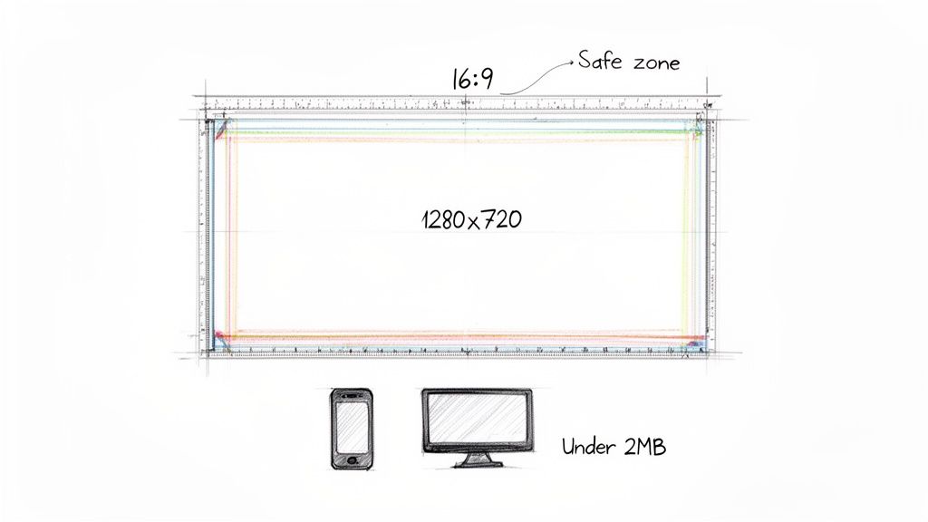
To create a thumbnail that looks crisp and professional everywhere it appears, you have to play by a few technical rules. Think of these specs as the blueprint for your design. Getting them right from the start means your image will load fast and look exactly as you planned, without any weird stretching, pixelation, or cropping.
The big one is size. For YouTube and most other video platforms, the magic number is 1280x720 pixels. This resolution is the sweet spot; it's sharp enough to look fantastic on a big-screen TV but optimized to load instantly on a phone. It also locks you into the standard 16:9 aspect ratio, which matches widescreen video players perfectly. Sticking to that ratio is critical if you want to avoid those distracting black bars on the sides of your image.
File Format and Size
When you're ready to export your finished design, you'll mainly be choosing between two file types: JPG and PNG. Most of the time, JPG is the way to go. It gives you a great-looking image with a much smaller file size, which is a huge plus for loading speed. PNGs are really only necessary if you need a transparent background, but they tend to be much larger files.
Whichever you choose, you absolutely have to keep the file size under YouTube’s 2MB limit. If your file is too big, it can actually slow down the page load for a potential viewer, and that friction is the last thing you want. Keeping it lean ensures your thumbnail pops up instantly in a busy feed.
Understanding Thumbnail Safe Zones
Here's something a lot of creators forget: the safe zone. This isn't a technical setting but a design principle. It’s the central part of your thumbnail that won't get covered up by the platform's own interface.
Your most important stuff, like the expressive face, the bold text, and the key object, has to live inside this safe zone. If it doesn't, you risk a timestamp or a "Watch Later" icon completely hiding it.
It’s a gut-wrenching feeling to upload what you think is a perfect thumbnail, only to realize the video's time counter is sitting right on top of your headline. To avoid that headache, just follow these simple rules:
Steer Clear of the Corners: Don't put anything important in the four corners. This is prime real estate for YouTube's overlays.
Keep it Centered: Your main subject and any critical text should be concentrated in the middle two-thirds of the frame.
Do a Mobile Check: Before you finalize anything, shrink it down and see how it looks on a phone screen. The UI elements take up way more space on mobile, so what looks fine on a desktop might be a mess on a smaller device.
Respecting these technical specs and designing for the safe zone ensures all your hard work pays off, and your thumbnail can do its job effectively on any screen.
Proven Design Strategies to Boost Your Click-Through Rate
Alright, let's move from theory to what actually works. Getting more people to click on your videos comes down to a few specific, actionable strategies that top creators use every single day. They know that great thumbnail design is part art, part science. It's about using proven principles to stand out in a sea of content and win that all-important click.
The good news is, these strategies aren't rocket science. They’re built on basic visual concepts that grab a viewer’s eye and send a clear message in a split second. Master these, and you'll see a real difference in your click-through rate.
Use High Contrast and Vibrant Colors
First things first: your thumbnail is in a constant fight for attention. To make it pop, you absolutely have to use high contrast. I’m talking about pairing very light elements with very dark ones, or slapping a super vibrant color against a plain, muted background.
Think of a bright yellow tennis ball against a deep blue court. That kind of sharp visual separation makes your thumbnail instantly readable. Steer clear of muddy, low-contrast colors that just blend together and disappear into the feed.
Establish a Single, Clear Focal Point
Ask yourself: what's the one thing a viewer must see? Your thumbnail design needs to have a dead-simple answer to that question. A cluttered design with ten different things fighting for attention just creates noise, and people will scroll right past it.
Your focal point could be anything, as long as it’s clear:
A person’s face showing a big, raw emotion.
The one key object your video is all about.
A few bold, intriguing words of text.
Everything else in the thumbnail should support that one main element, not fight with it. A clean layout with one dominant focus always beats a busy one. If you want to go deeper on this, check out our guide on how to make great YouTube thumbnails.
Maintain a Consistent Brand Style
While every thumbnail needs to be tailored to its video, keeping a consistent style across your channel is what builds a recognizable brand. When a viewer can spot your videos instantly in a crowded subscription feed, they're way more likely to click.
You can build brand consistency through a few simple things:
A recurring color palette: Pick 2-3 key colors and stick with them.
Consistent typography: Use the same font family every time.
A recurring layout: Maybe your face is always on the left, or your logo is always in the bottom-right corner.
This kind of consistency builds trust and actually encourages people to binge your content because it all feels familiar and connected.
A thumbnail's job is to make a promise. Great design strategies ensure that promise is clear, compelling, and instantly understood, making the click an easy decision for the viewer.
These small tweaks can have a massive impact. I've seen videos hit 1,000 views per hour with an 11% CTR on day one, while a similar video struggles at a 6.7% CTR and goes nowhere. Simple changes, like adding a face with a strong emotion, can boost CTR by 20-30%. The data doesn't lie, and you can see just how powerful these adjustments are by exploring a creator's analytics breakdown.
How AI Tools Can Transform Your Thumbnail Workflow
For most creators, making a great thumbnail for every single video is a serious bottleneck. It can easily eat up hours of your time wrestling with design software, hunting for the perfect still frame, and arranging every element just right. But what if you could change all that? AI-powered tools are flipping the script on this workflow, turning a creative chore into a quick, surprisingly simple task.
These tools do way more than just give you a blank canvas. They actually analyze your video’s content to give you a massive head start, which is the secret to making better visuals in a fraction of the time.
Putting the Creative Process on Autopilot
Picture this: you upload your finished video and, almost instantly, get a handful of professionally designed thumbnail options to choose from. That's the real magic of an AI thumbnail maker. It takes care of all the tedious stuff for you.
For instance, a good AI tool can:
Pinpoint the Best Frames: It scrubs through your entire video to find the moments with the best facial expressions and clearest action, so you’re always starting with the most compelling source material.
Remove Backgrounds in One Click: Forget the headache of manually tracing and cutting out subjects. The AI can isolate a person or object from the background flawlessly.
Suggest Smart Text Overlays: Based on your video's content and title, it can generate punchy, relevant text and place it in the most readable spot.
This kind of automation means you're never starting from zero. Instead, you're starting with designs that are already 90% of the way there, letting you make a few final tweaks and move on.
Here’s a glimpse of what an AI thumbnail generator's interface can look like. It’s all built for speed, helping you go from video upload to a finished thumbnail in just a few clicks.
The entire experience is designed to get you in and out fast, so you can get back to creating.
Smarter Design Through Data and A/B Testing
One of the biggest wins with AI is its ability to create tons of different design variations in seconds. This isn't just about having options; it's about making A/B testing practically effortless. Instead of having to build two completely different designs from the ground up just to see which one works better, the tool can do it for you automatically.
By making A/B testing simple, AI tools give creators the power to make decisions based on real data, not just gut feelings. You can quickly learn what your audience clicks on and use that knowledge to boost your CTR on every future video.
This whole process takes the guesswork out of design. You can easily test different facial expressions, color palettes, or text hooks to find the exact formula that grabs your audience's attention every time.
The end result is a workflow that’s not just faster, but a whole lot smarter. You get back precious time you can pour into your next video, all while creating thumbnails that are actually proven to perform better. If you want to dive deeper, you can learn more about how AI-generated thumbnails can give you a real advantage. These tools truly level the playing field, giving any creator the power to produce professional, high-impact visuals without needing a degree in graphic design.
Got Questions About Video Thumbnails? Let's Answer Them.
Now that we've covered the what, why, and how of making great thumbnails, you probably have a few specific questions bouncing around in your head. That's good. It means you're thinking like a creator.
Let's dig into the most common questions I get. Think of this as the practical, real-world advice you need after your video is live. We'll cover everything from testing your designs to reviving old content.
How Do I Actually A/B Test My Thumbnails?
A/B testing is how you stop guessing and start knowing what your audience clicks on. The idea is simple: you create two different thumbnail designs for the same video, show each one to a different chunk of your audience, and see which one gets more clicks.
The golden rule here is to change only one major element at a time. Seriously, just one. Maybe you test a different facial expression. Or swap a blue background for a red one. Or try a completely different line of text. If you change everything at once, you'll have no idea what actually made the difference.
Thankfully, platforms like YouTube are making this easier with built-in "Test & Compare" features. To get solid data, you'll want to let the test run for at least 7 to 14 days. This gives you enough click-through rate (CTR) information to make a confident decision. The thumbnail with the higher CTR is your winner, and you've just learned something valuable for your next video.
Can I Change a Thumbnail After a Video Is Already Published?
Yes! And you absolutely should. Every major video platform lets you swap out a thumbnail whenever you want, even on a video that's years old. This is one of the most powerful and underused strategies for boosting your channel.
Got an older video with great watch time but a terrible click-through rate? The thumbnail is almost certainly the culprit. Giving it a fresh, modern design can make the algorithm see it in a new light and start recommending it to a whole new audience.
Swapping out a stale thumbnail is a low-effort, high-impact move. It can literally resurrect a dead video, giving your old content a second shot at success.
This one simple tweak can turn a forgotten video into a consistent source of views. It's a non-negotiable part of managing your channel for long-term growth.
What Are the Biggest Thumbnail Mistakes to Avoid?
Knowing what not to do is just as important as knowing what to do. I see creators make the same few mistakes over and over, and these missteps can kill a video's potential before it even has a chance.
Here are the biggest errors you need to watch out for:
Low-Resolution Images: A blurry, pixelated thumbnail screams "amateur." Always start with a high-quality photo or graphic and export it at the recommended 1280x720 resolution. No excuses.
Cluttered and Busy Designs: Don't try to cram your life story into a tiny rectangle. A viewer should be able to instantly understand what your video is about. If it takes more than a split second, it's too complicated.
Unreadable Text: Tiny text, a scripty font, or poor color contrast will be completely lost on a phone screen, which is where most people will see it. Make your text big, bold, and easy to read.
Misleading "Clickbait": Creating intrigue is smart. Lying is not. A thumbnail that promises something the video doesn't deliver will get you a click, but it will also get you an angry viewer who leaves in 10 seconds. This kills your watch time and your channel's reputation.
Ignoring the Safe Zones: Remember that the platform is going to plaster a time stamp or a "watch later" icon on your thumbnail. If you put your main subject or key text in a corner, it's going to get covered up. Keep the important stuff toward the center.
Steer clear of these common blunders, and you'll already be way ahead of the competition.
Ready to create stunning, high-performing thumbnails in minutes instead of hours? With Thumbnail Maker, our AI-powered platform analyzes your video, suggests the best frames, and generates multiple professional designs for you automatically. Stop wrestling with design software and start making data-driven decisions that boost your click-through rate.
Learn how to write a script for a YouTube video with this complete guide. Get actionable tips and frameworks to craft scripts that boost views and retention.
Struggling to increase your YouTube watch time? Learn proven strategies to boost audience retention, optimize content, and master the YouTube algorithm.